Design Changes
The data-driven design approach was greatly reinforced and perfected by the additional triangulation of an Heuristic Evaluation and a Cognitive Walkthrough.
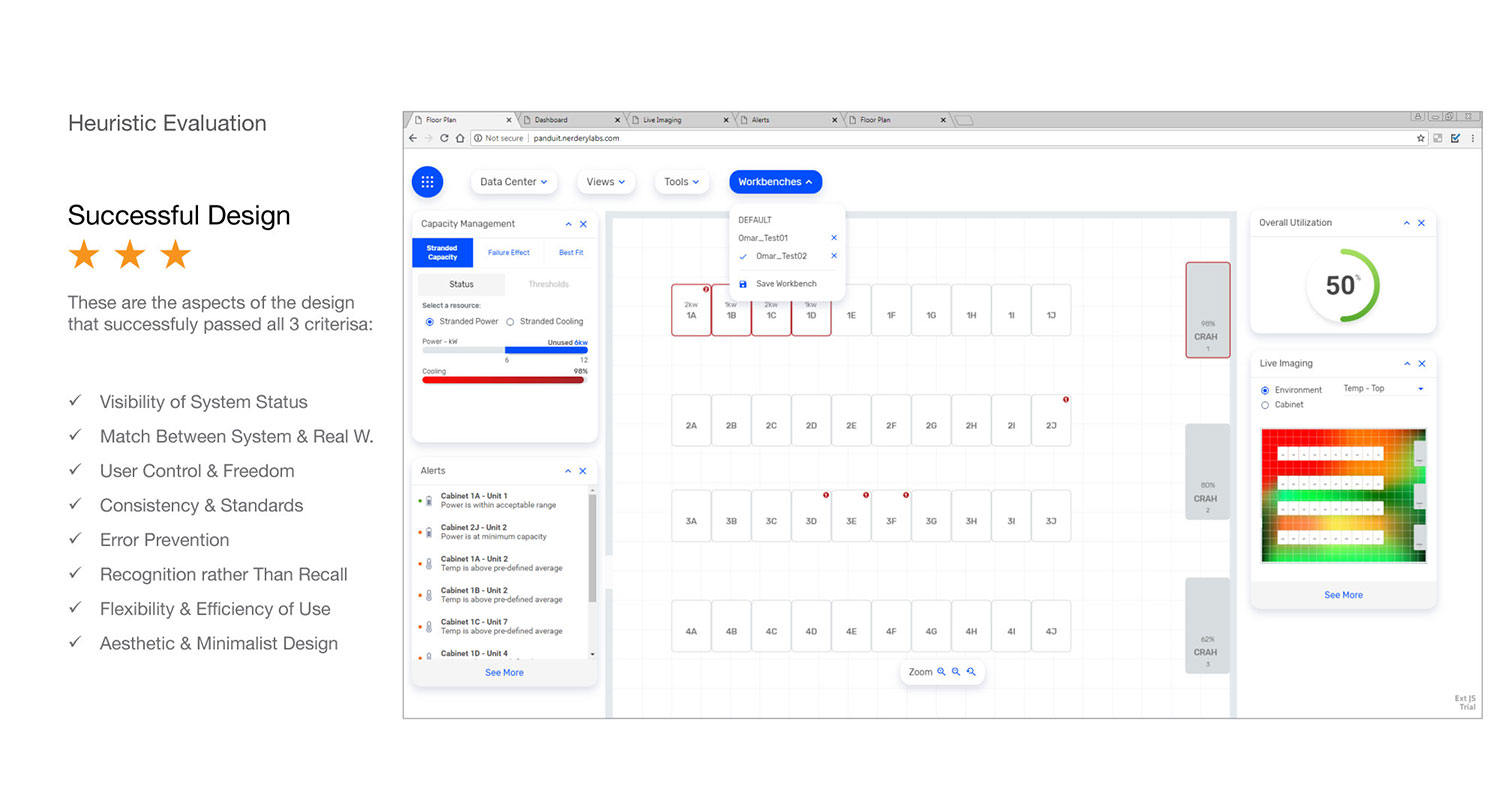
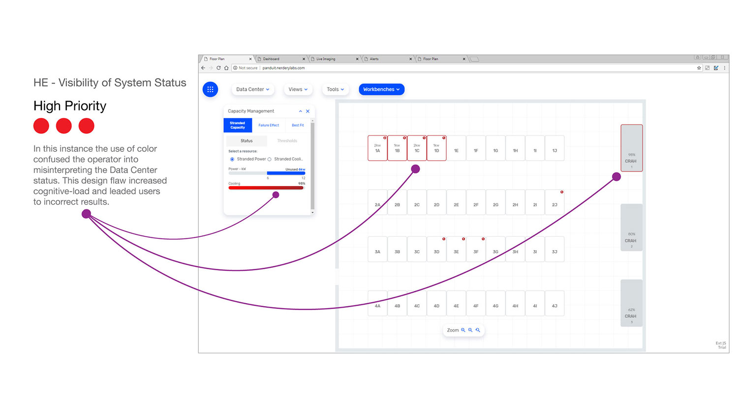
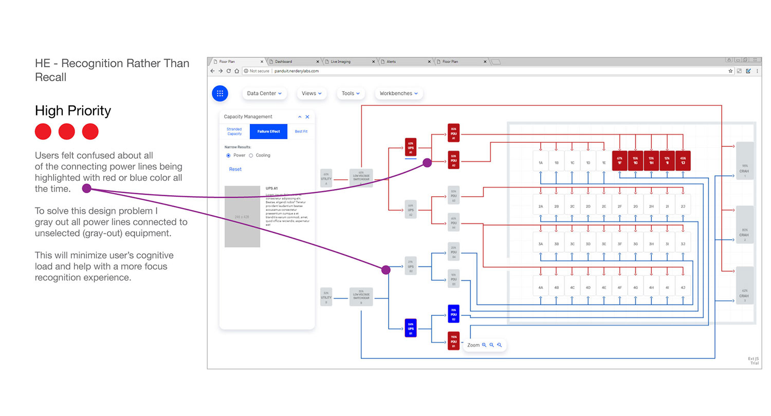
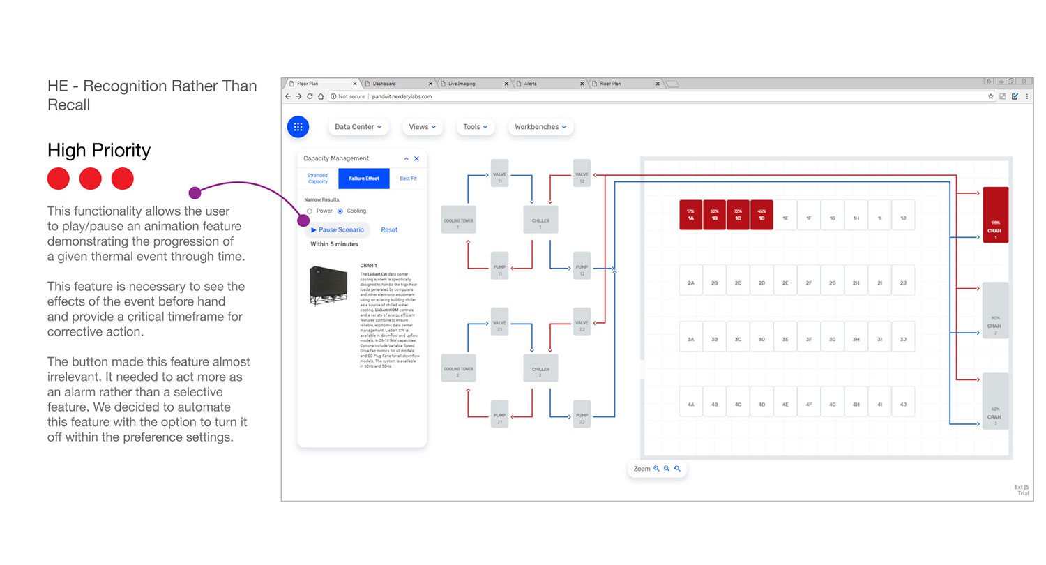
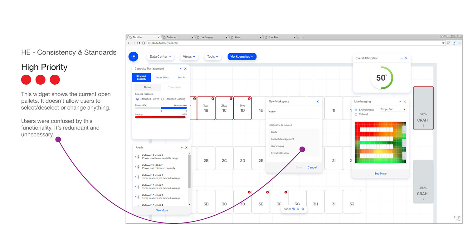
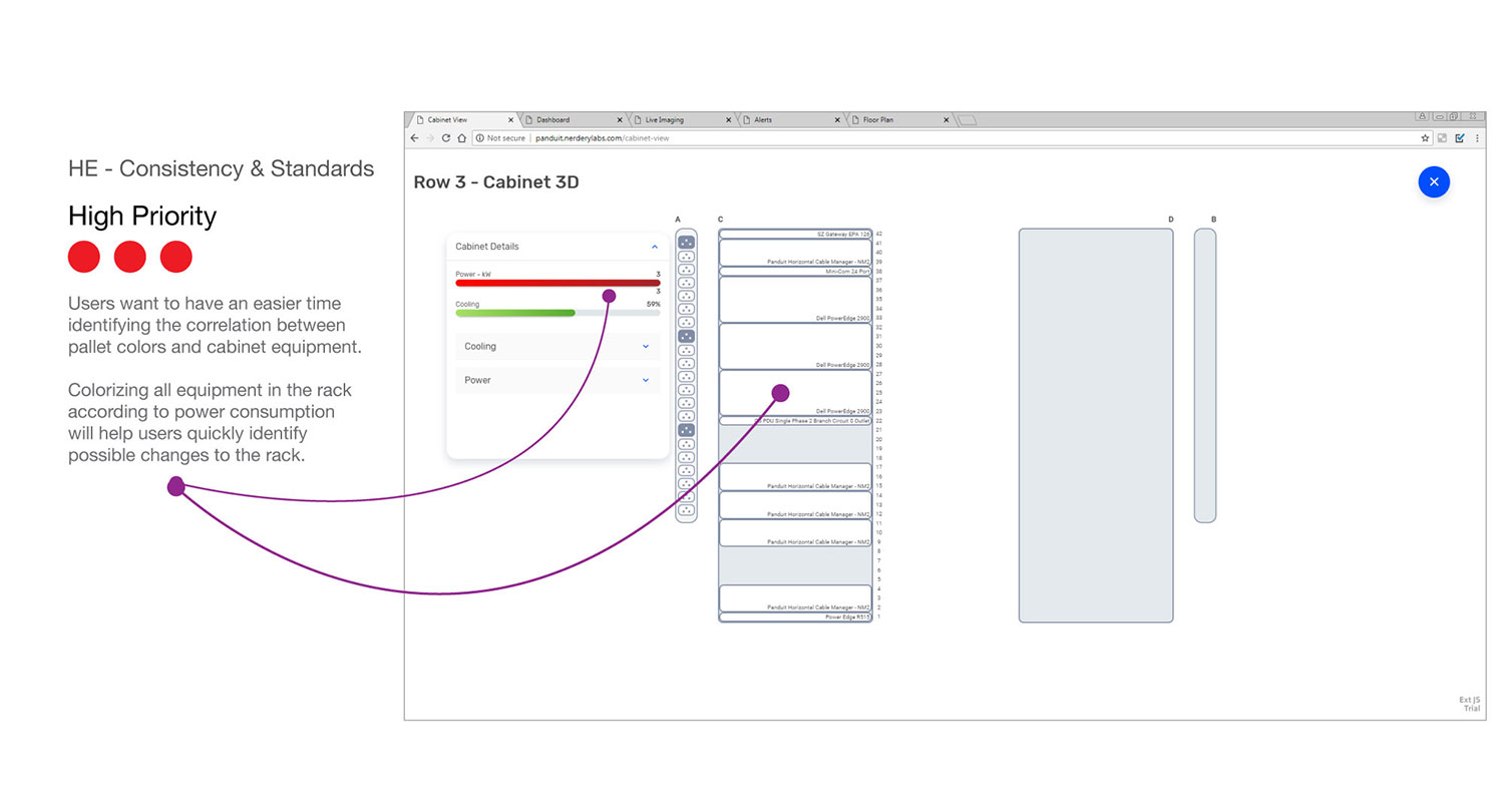
Heuristic Evaluation
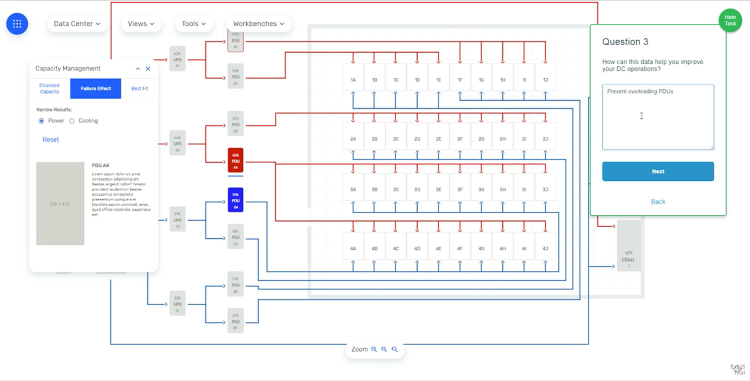
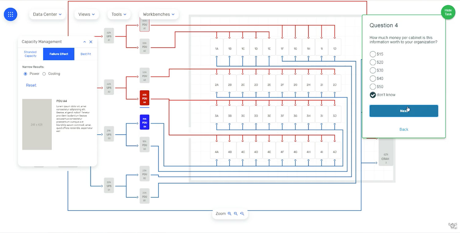
This analysis helped us determine aspects of the design that needed improvement even before we tested it with users. But the combination between user’s feedback and heuristic evaluation principles provided strong cases for both, justifying design decisions, and supporting new enhancements. The ranking priority here is a bit peculiar. Enhancements categorized as 'High Priority' were those considered for immediate implementation. Those categorized as 'Low Priority' became part of a backlog for future inclusion. The 3 stars or red-dots method used here shows 3 separate sources of support included first, the business unit, such as sales, executives, and business analysts. Second, the product division, including PMs, engineering, and UX. Third, all user research and/or industry data. Any combination of these sources of support adding to 3 or more was considered a majority consensus.
Cognitive Walkthrough
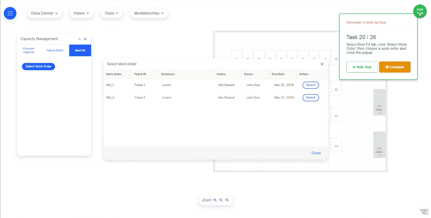
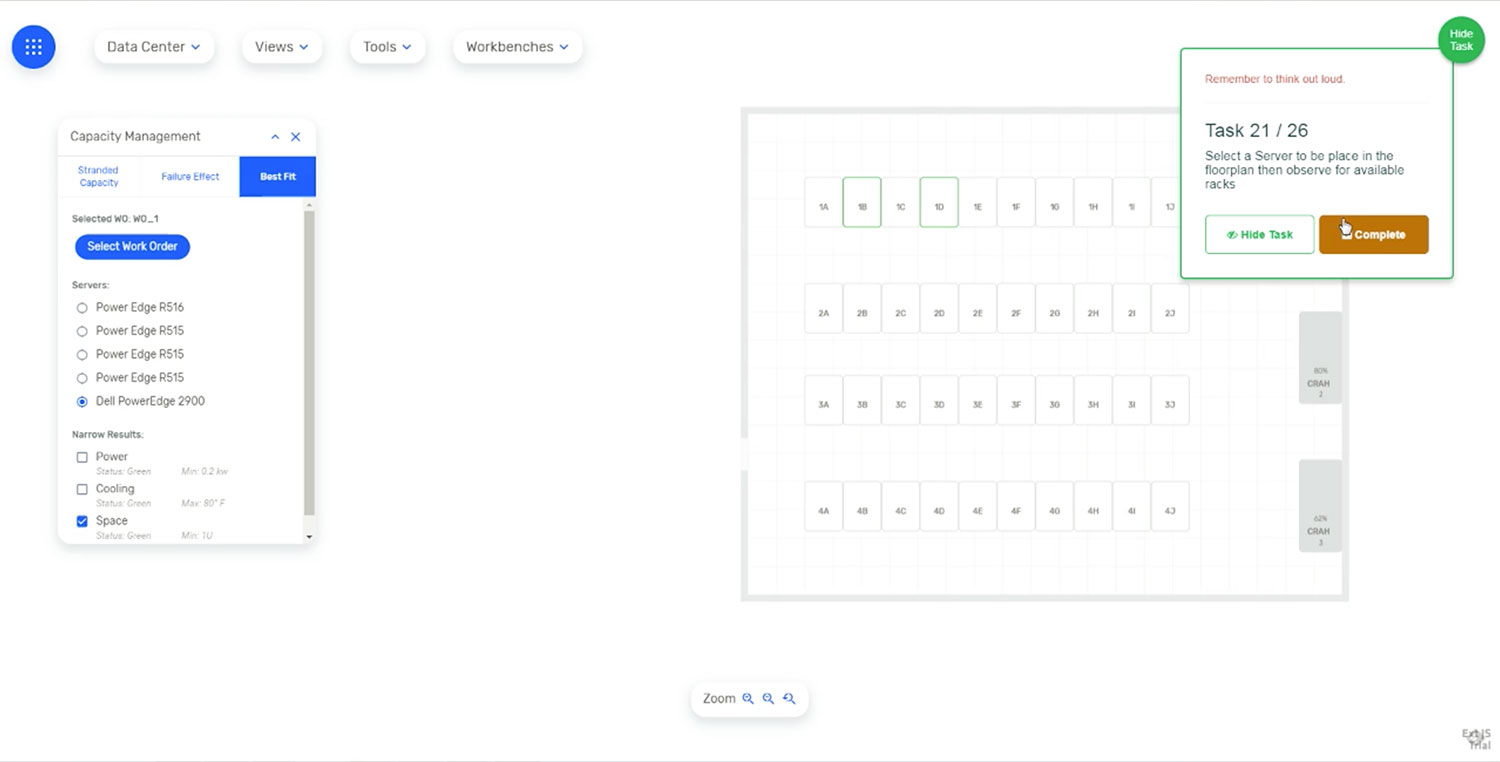
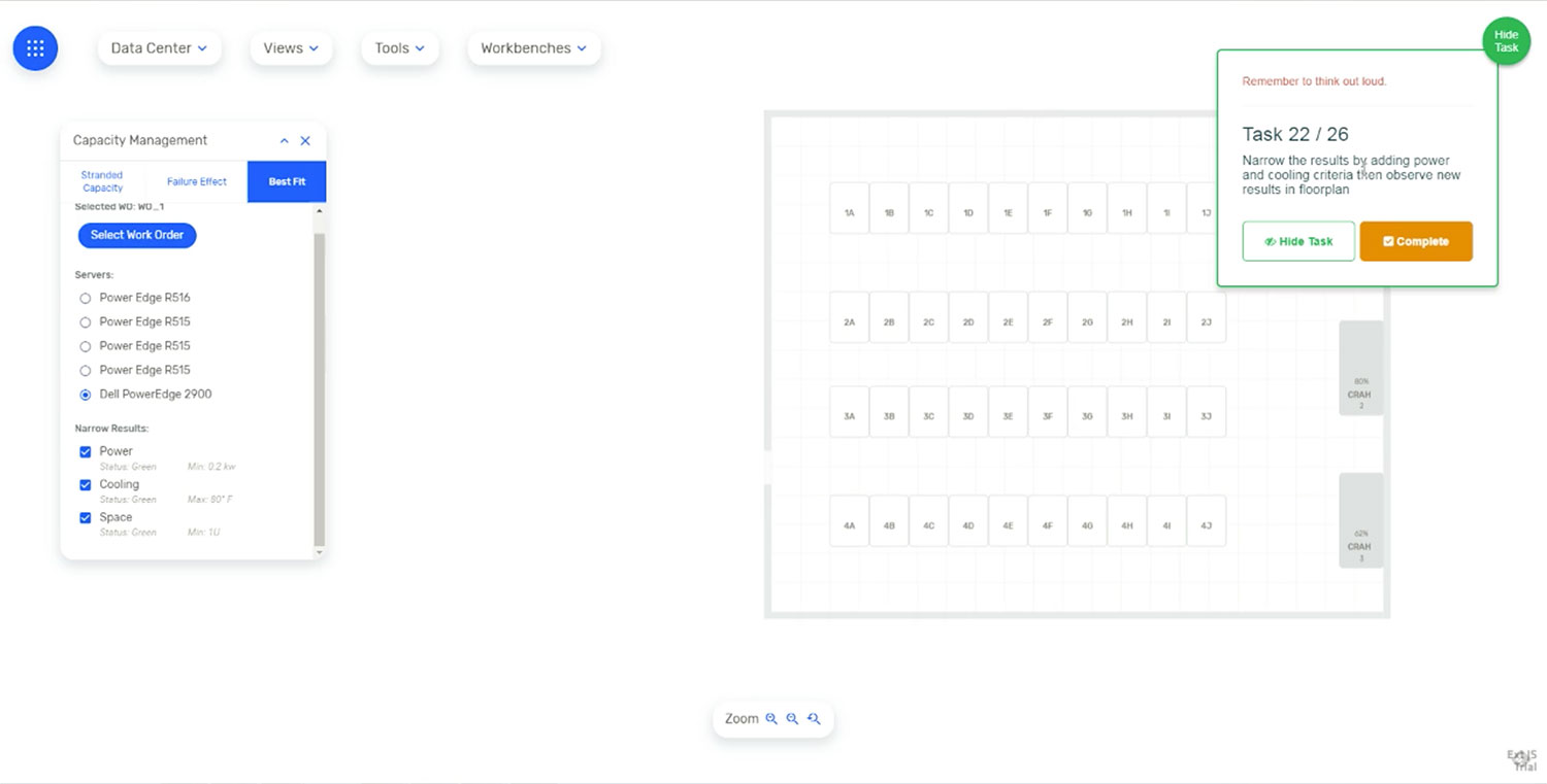
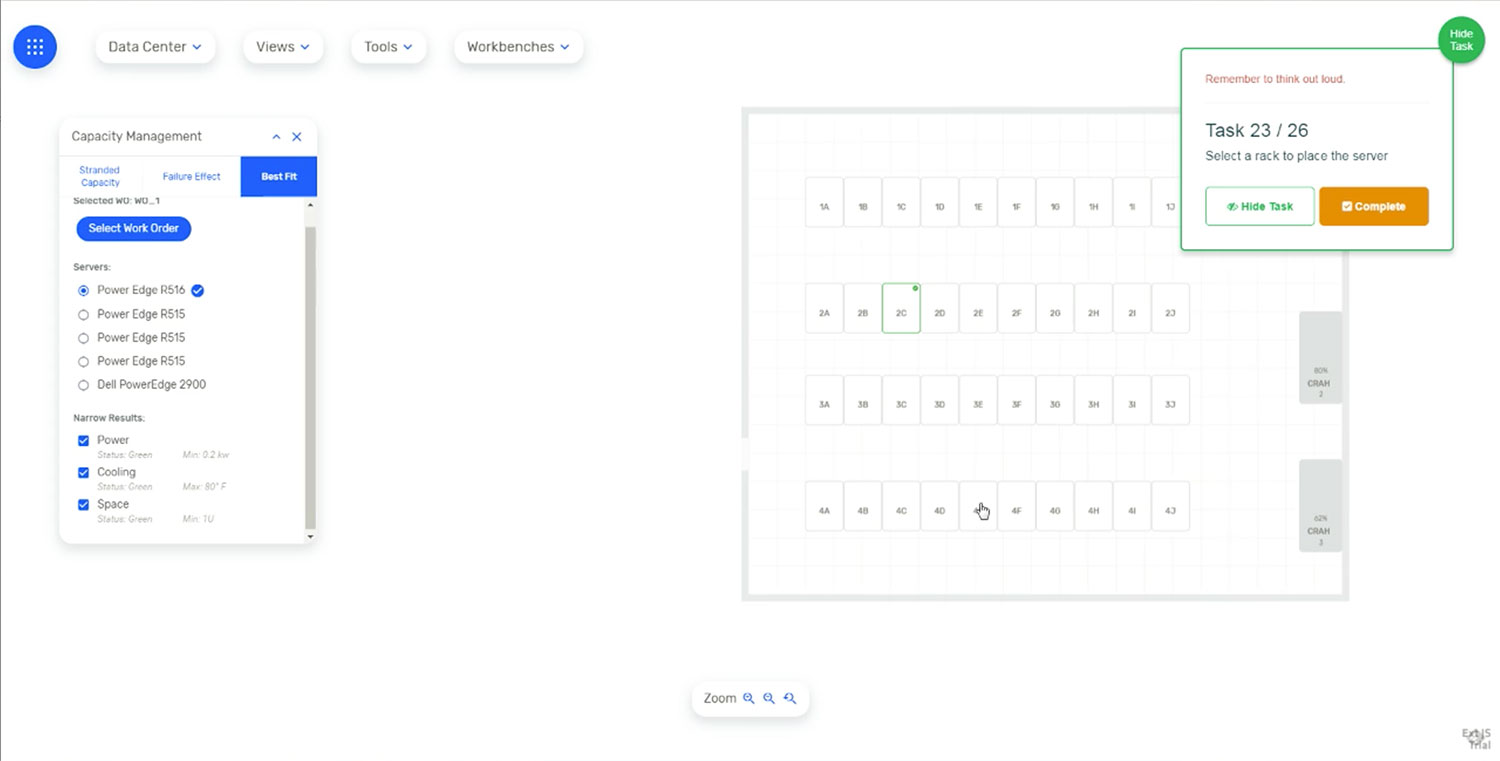
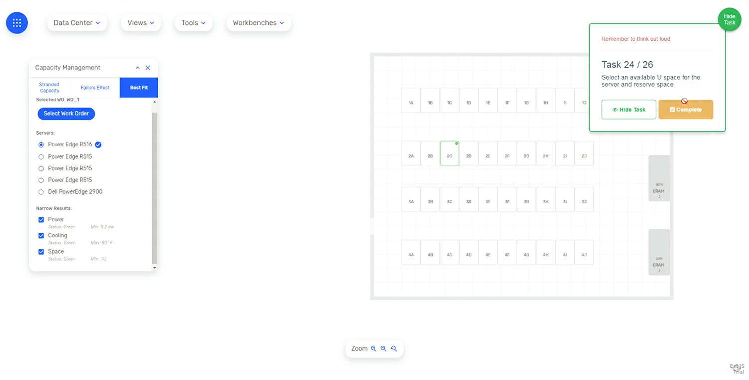
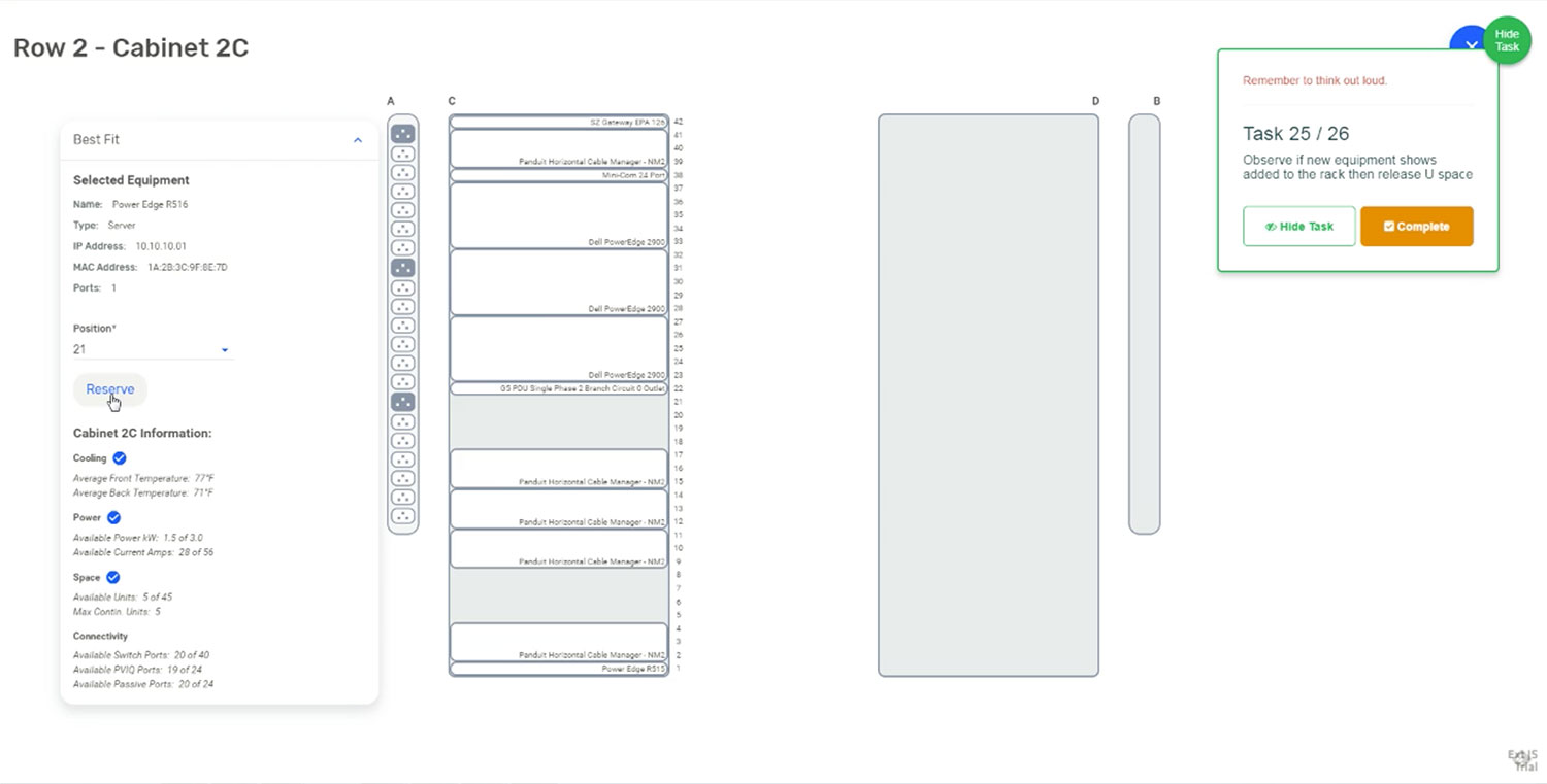
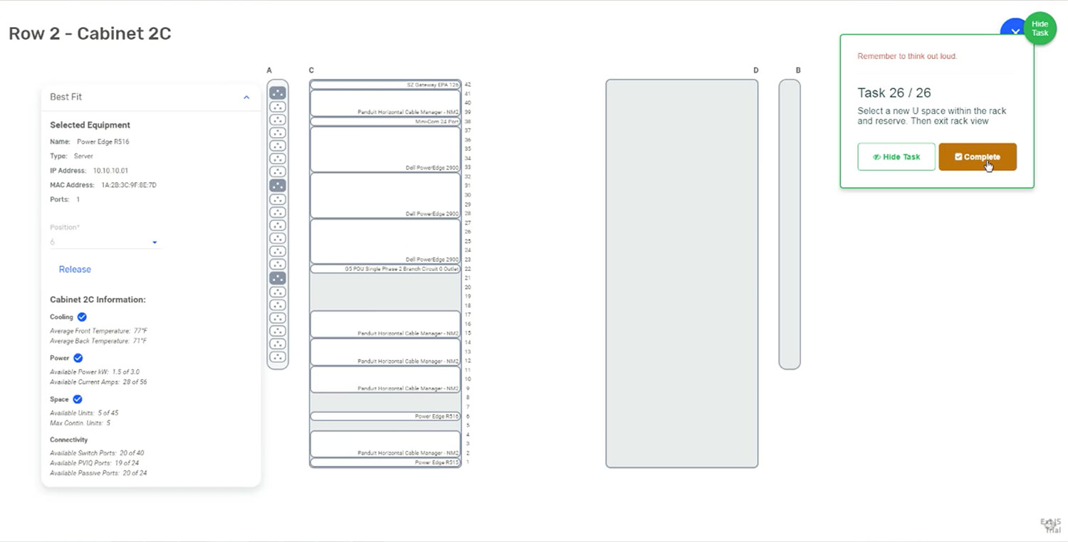
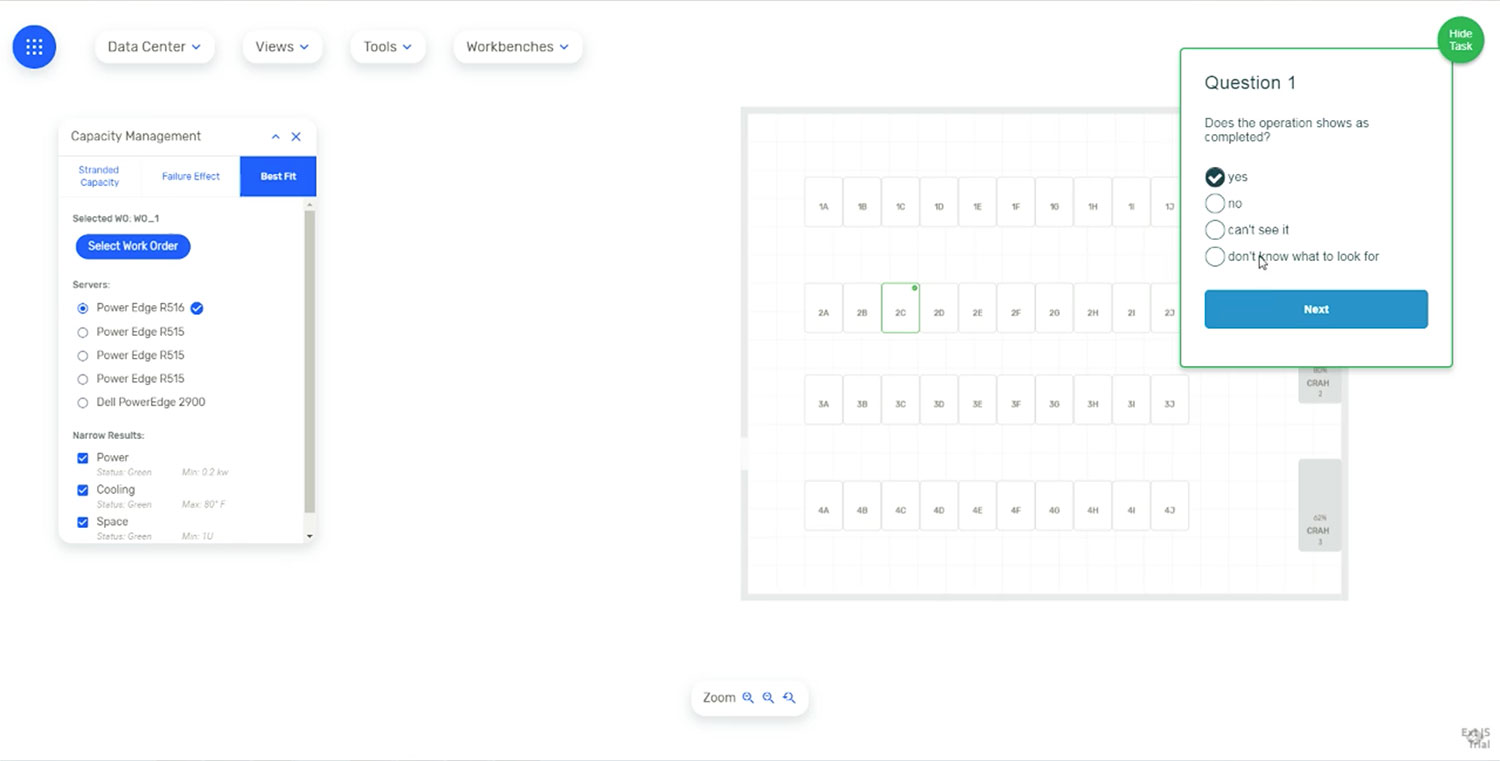
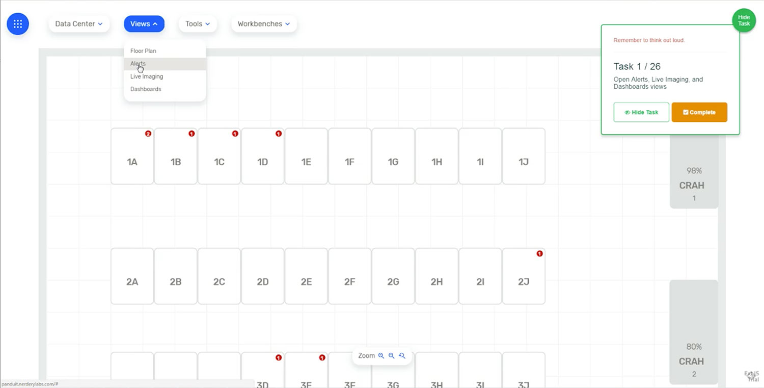
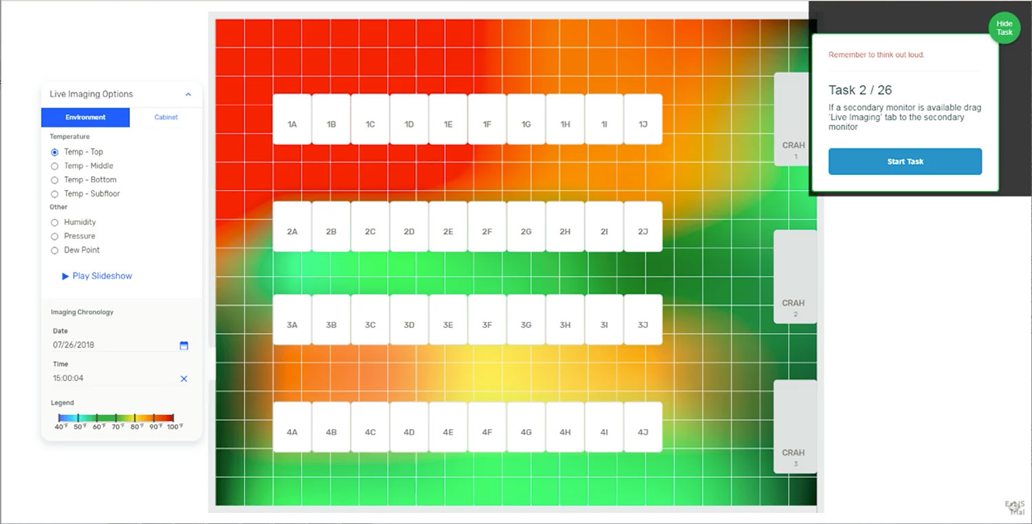
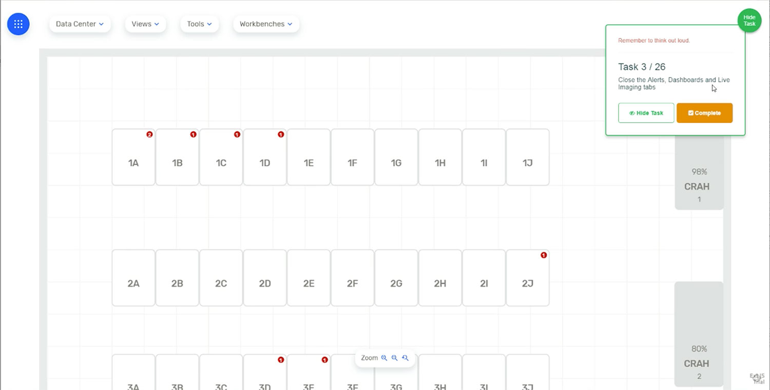
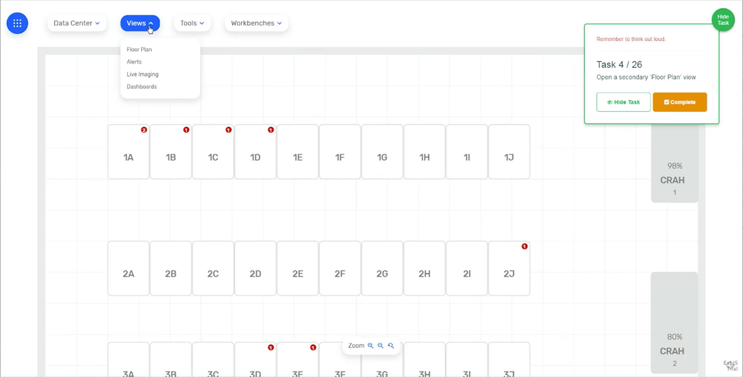
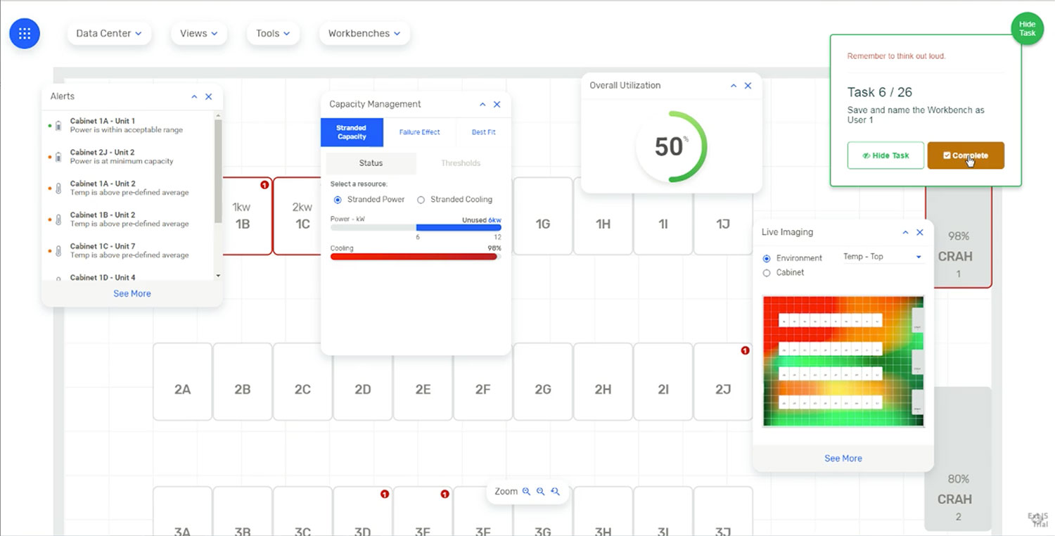
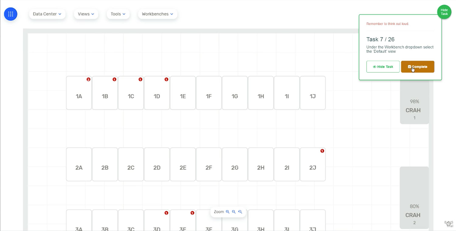
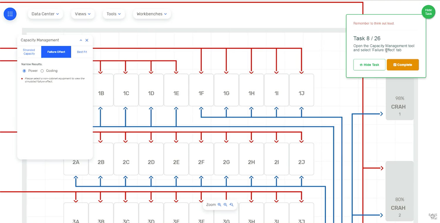
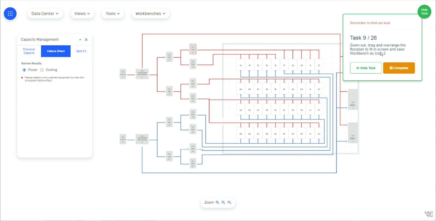
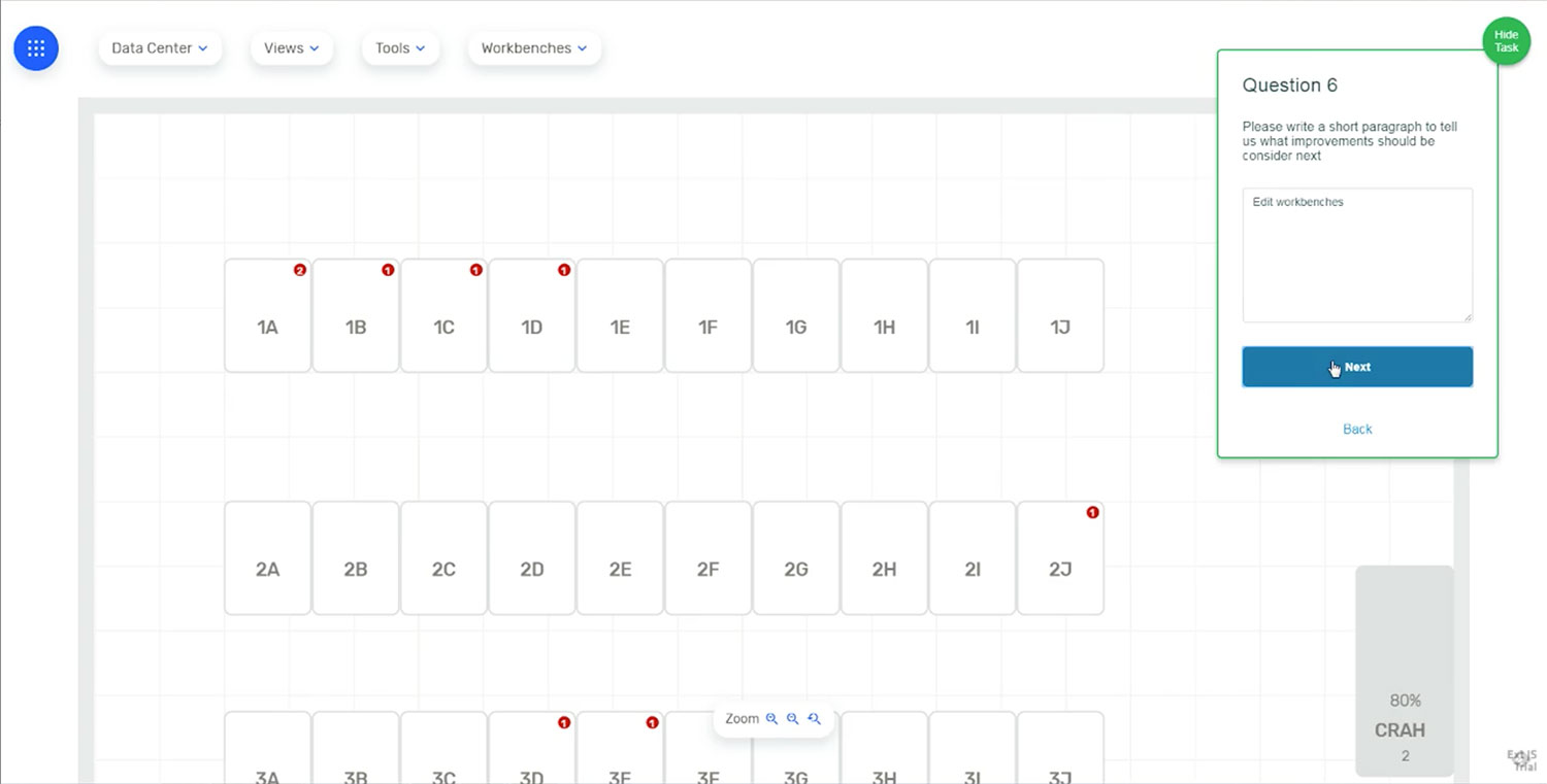
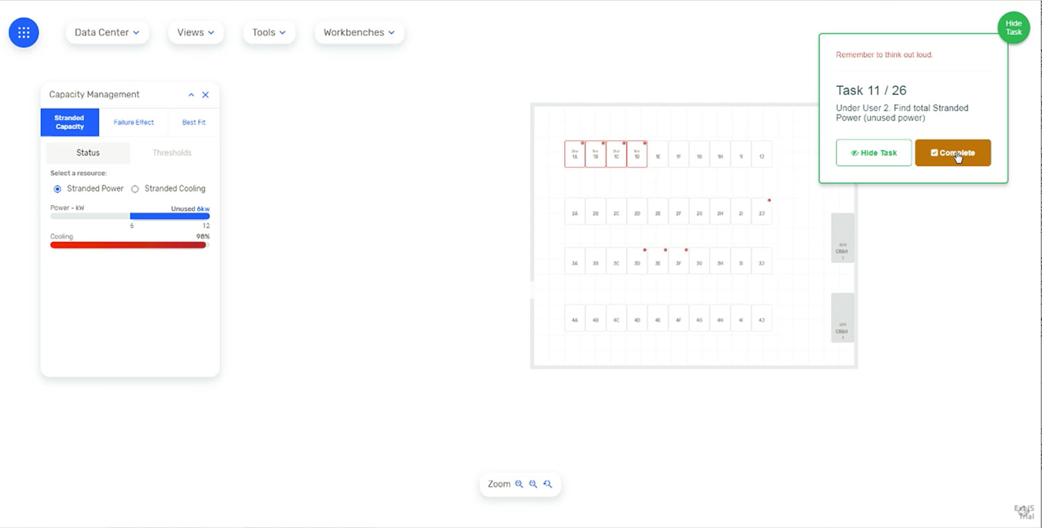
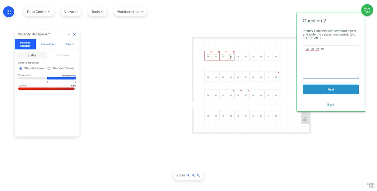
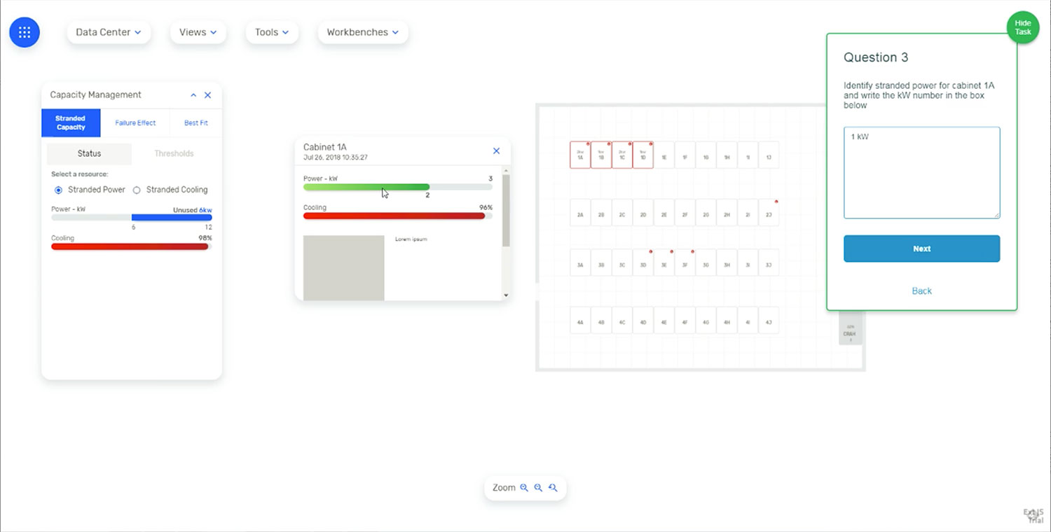
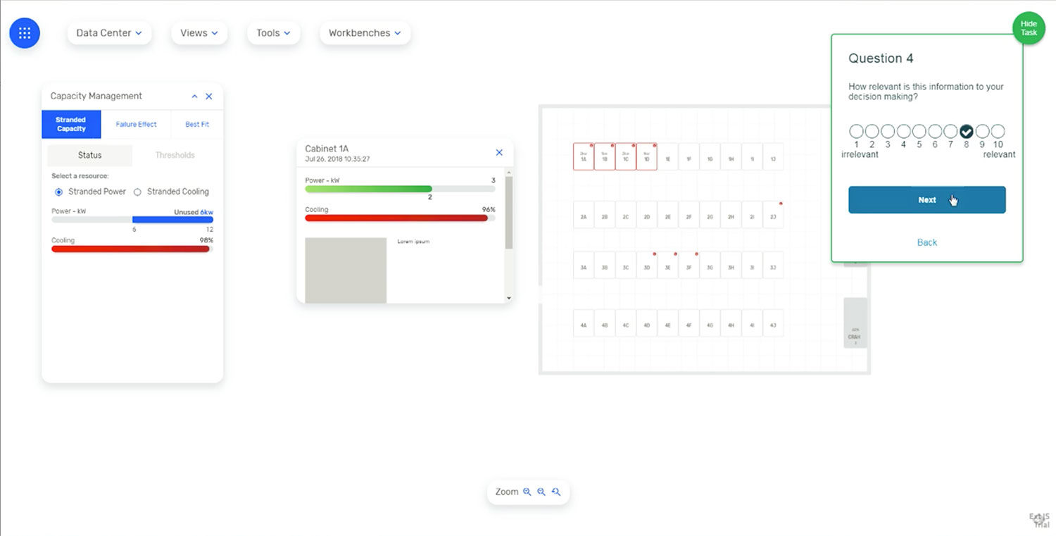
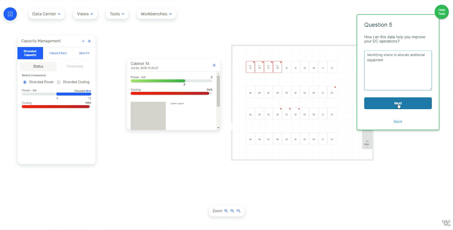
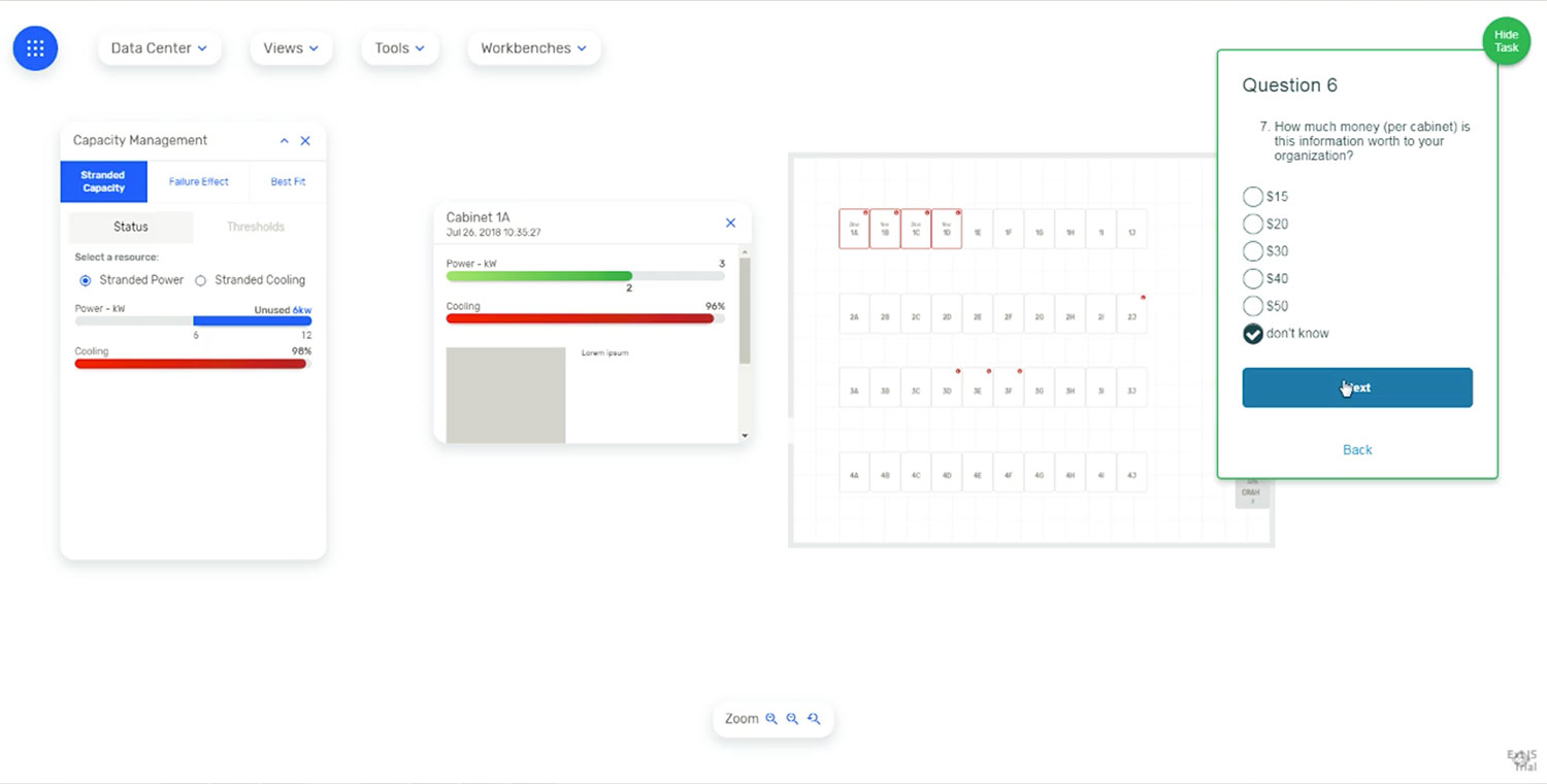
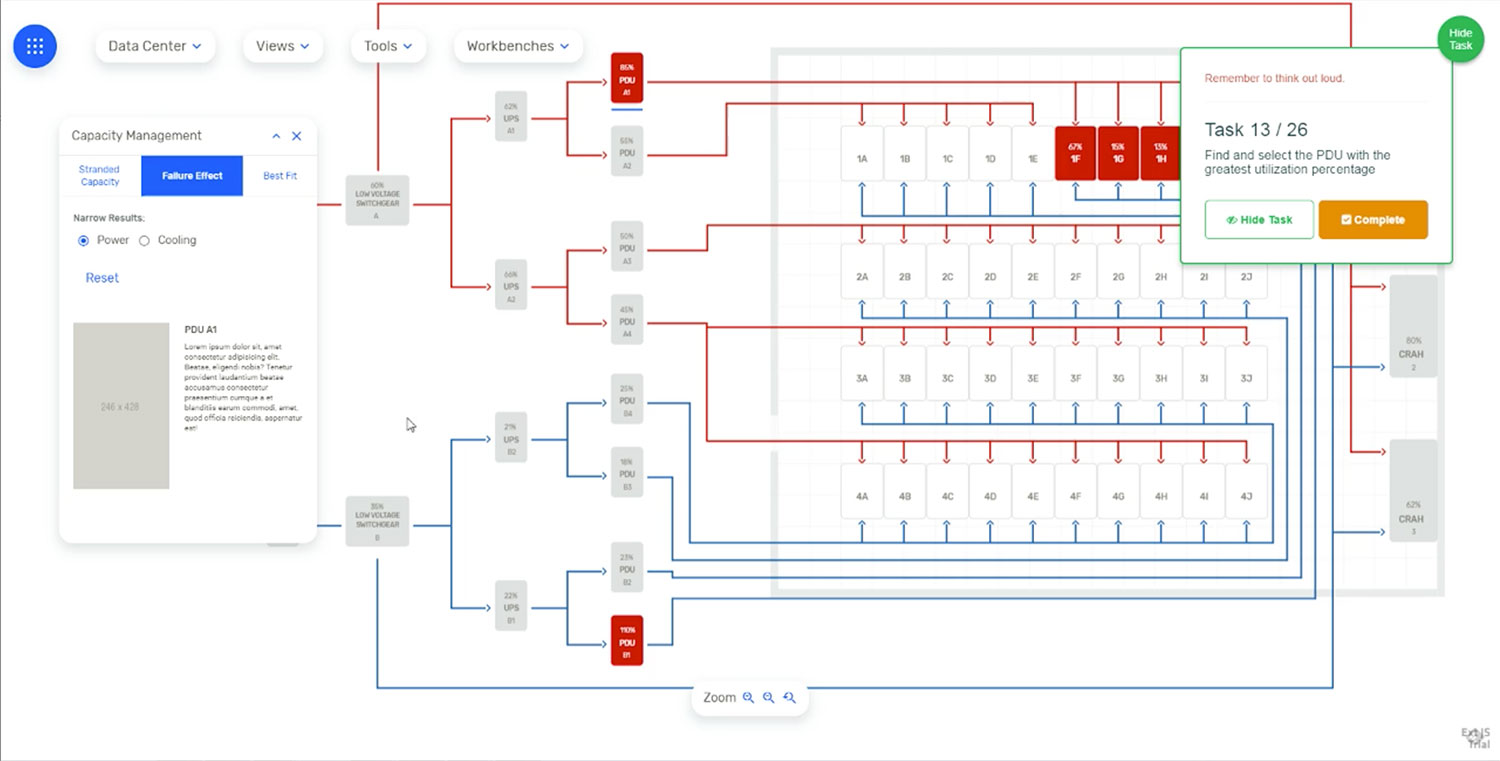
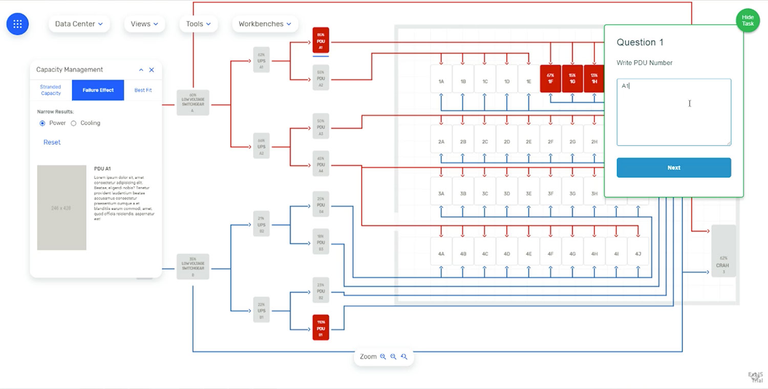
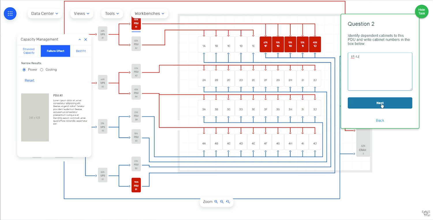
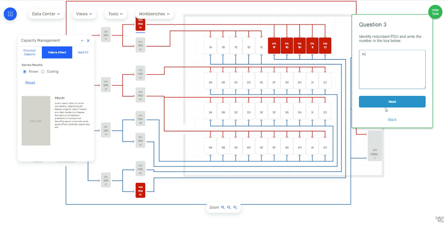
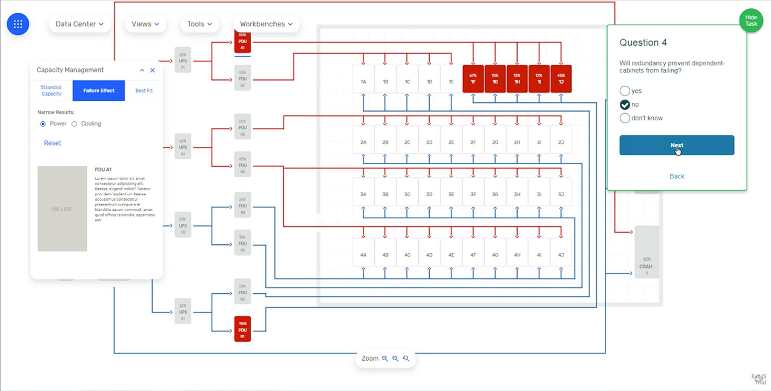
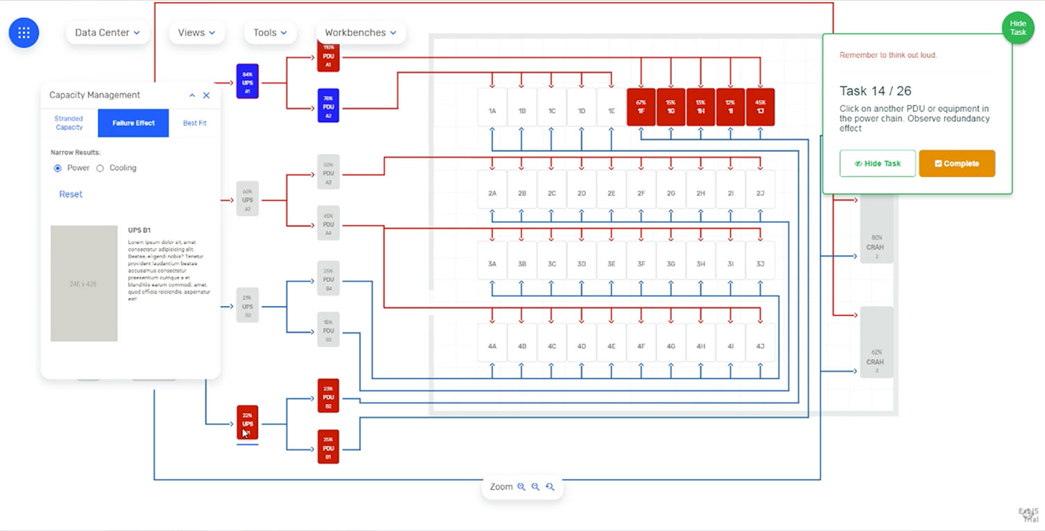
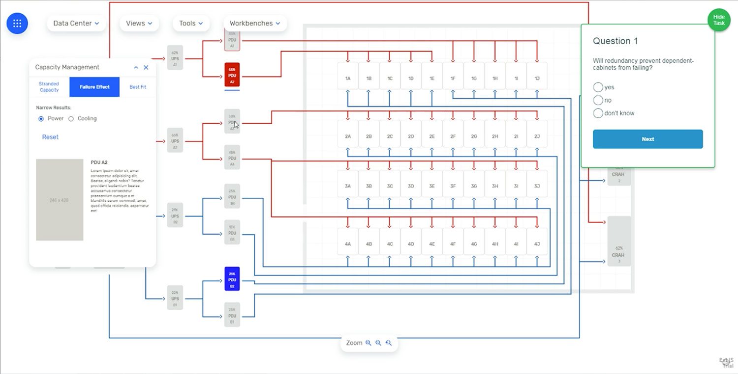
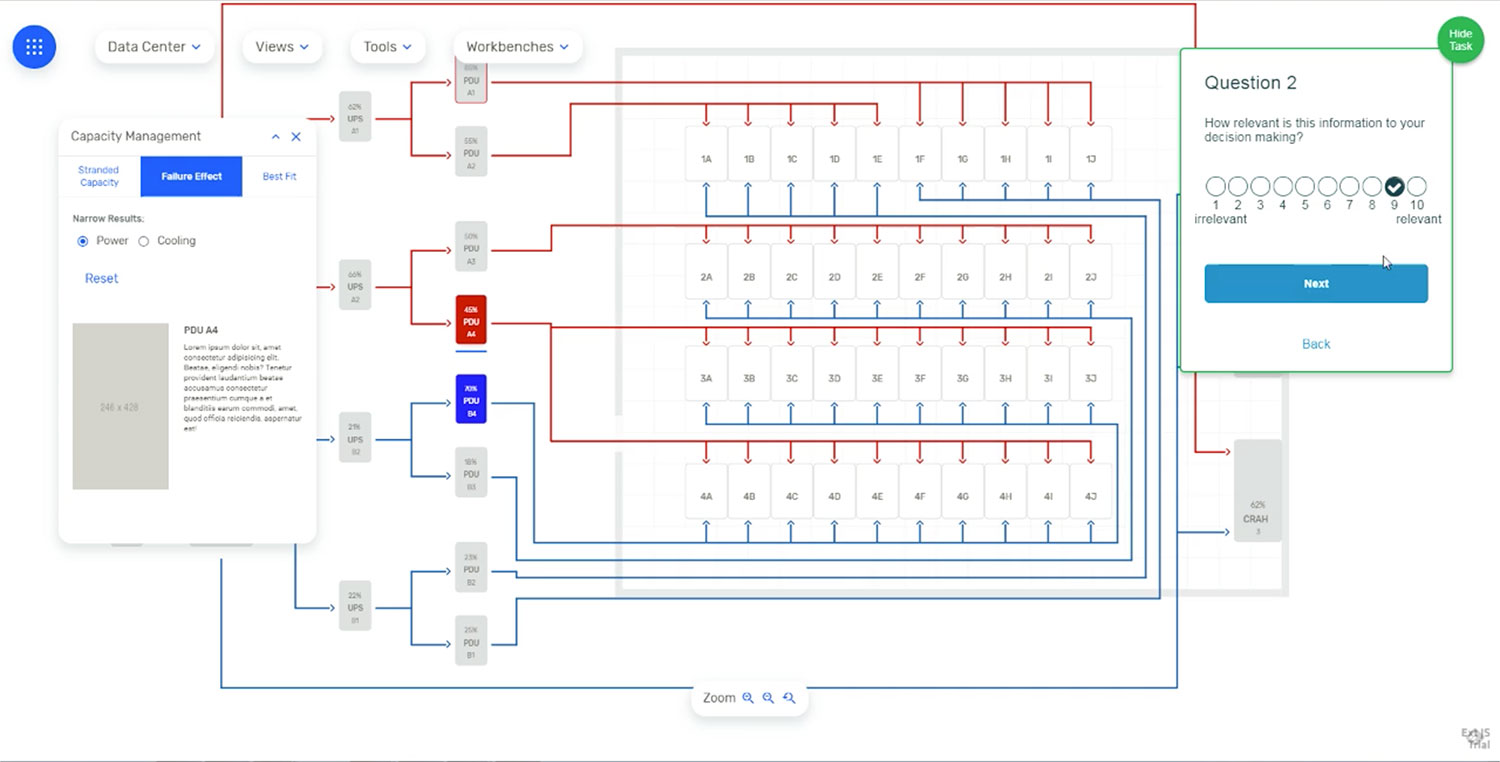
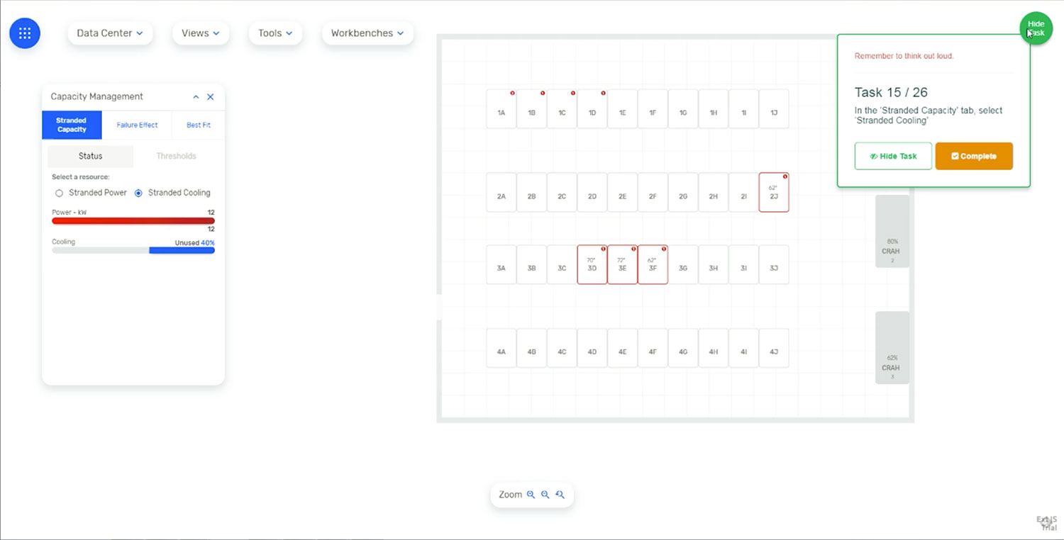
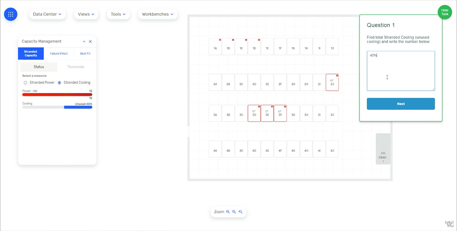
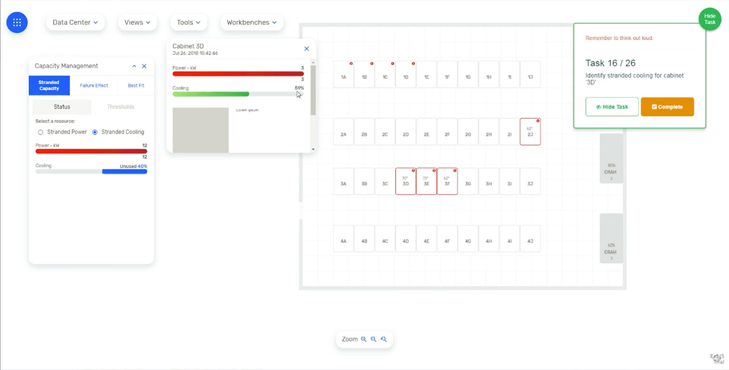
This method helped us determine the usability flow, and evaluate the information architecture and navigational aspects of the design. This was a key exercise for a successful mental mapping of the mix, between tasks and events. The new design showed a superior user navigation experience, as users were able to successfully complete 24 out of 26 tasks, while navigating through 156 interactions. This test was conducted without any prior training to users and very little guidance from the moderator. This showed an intuitive design with affordances that provided users with the correct mental impression, and guided them to perform the right action and obtain the correct desired data.
Tasks: 1-9 - General Navigation.


Task: 11 - Stranded Capacity - Power.

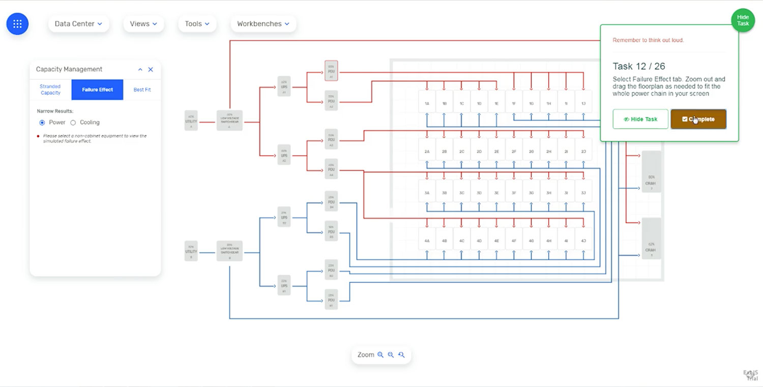
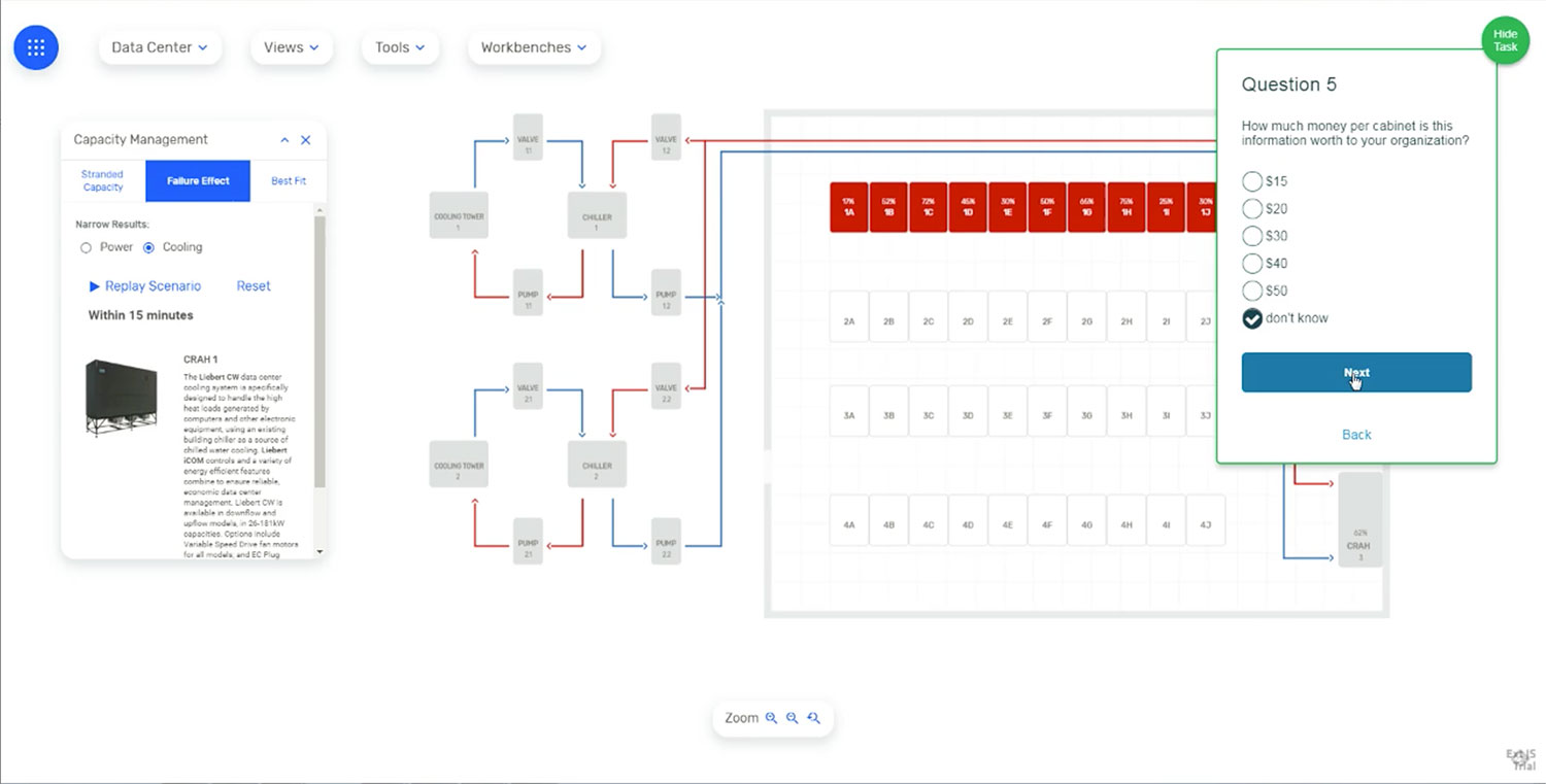
Tasks: 12-14 - Failure Effect - Power.
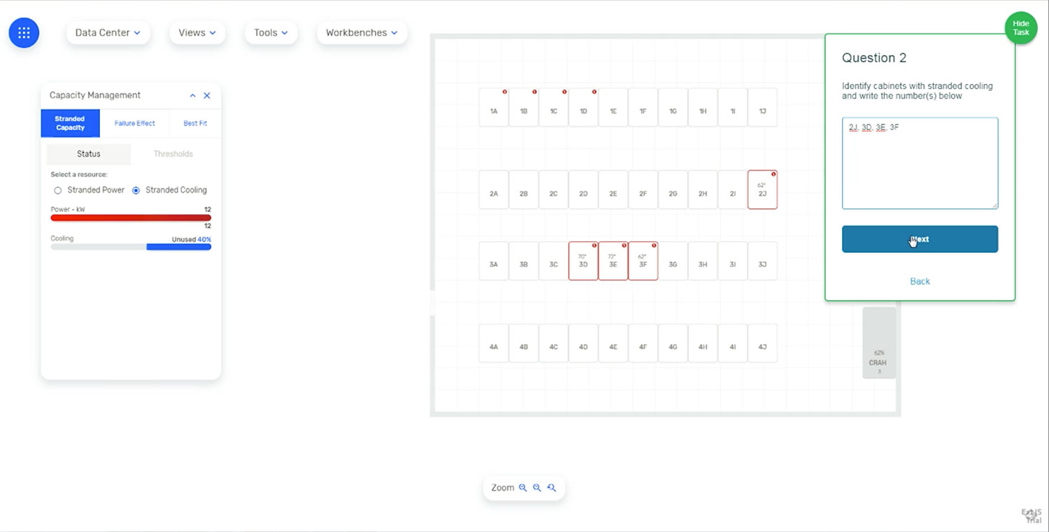
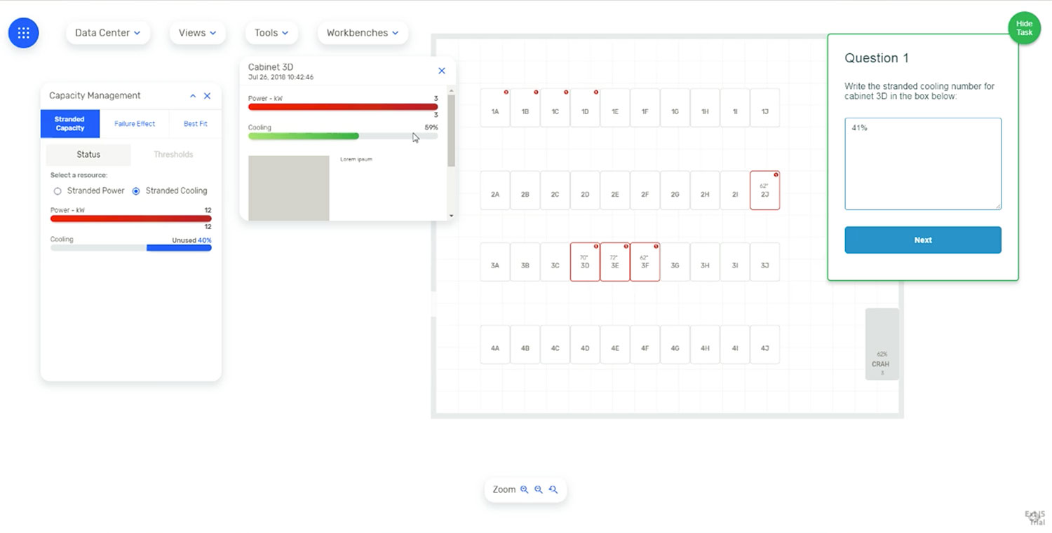
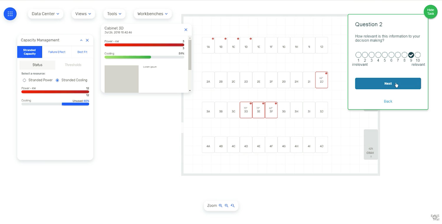
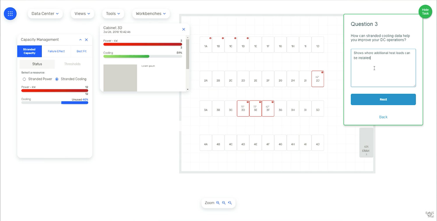
Tasks: 15-16 - Stranded Capacity - Cooling.
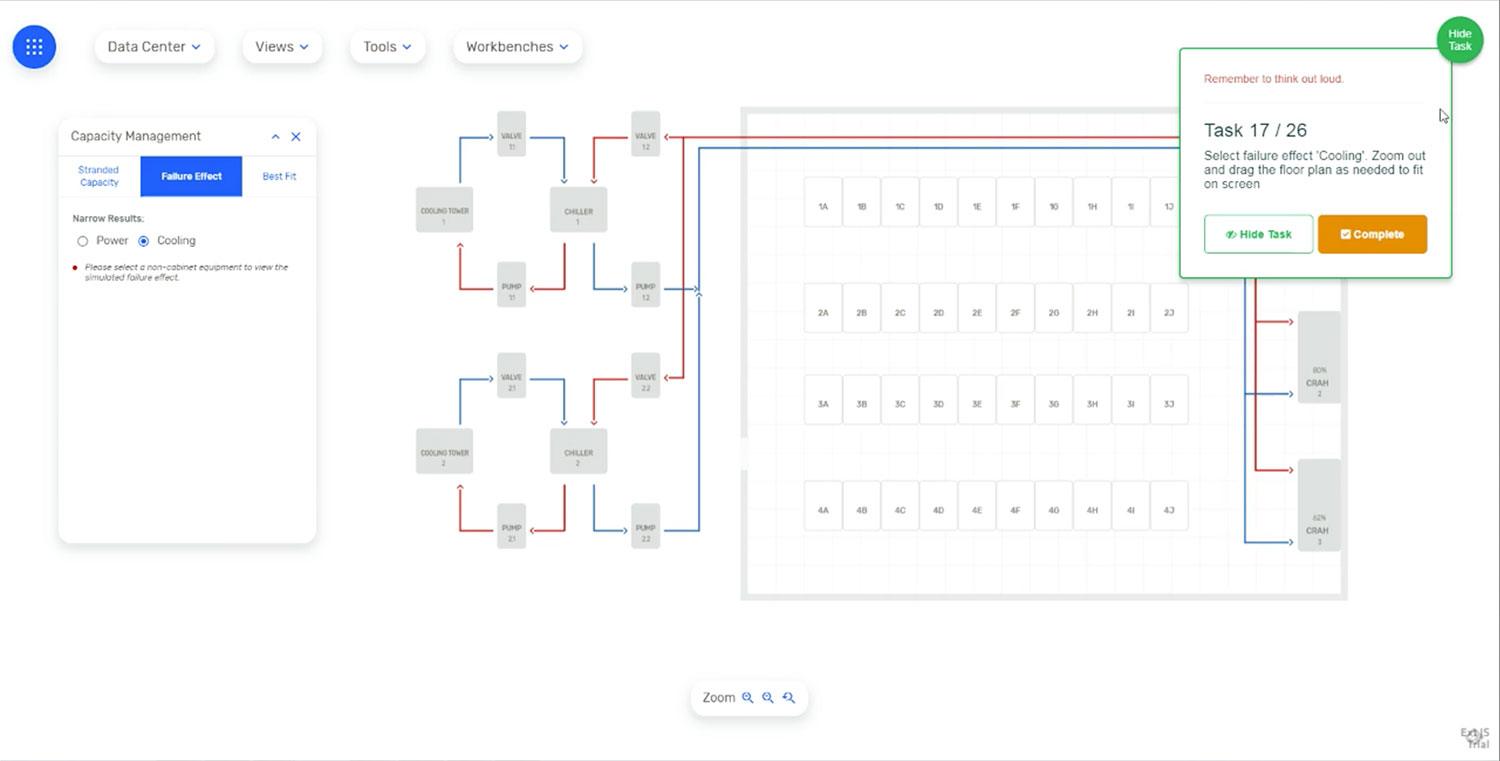
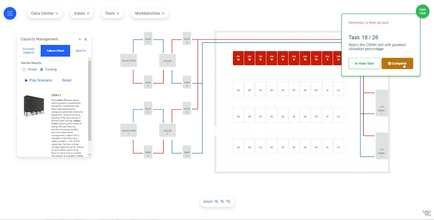
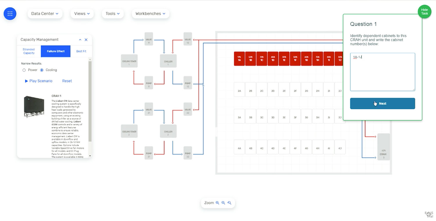
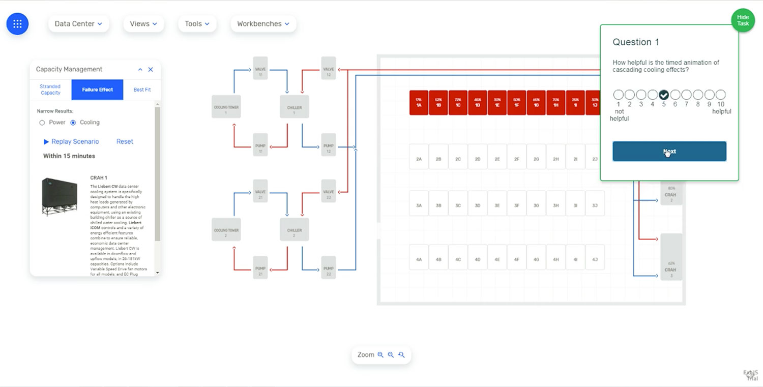
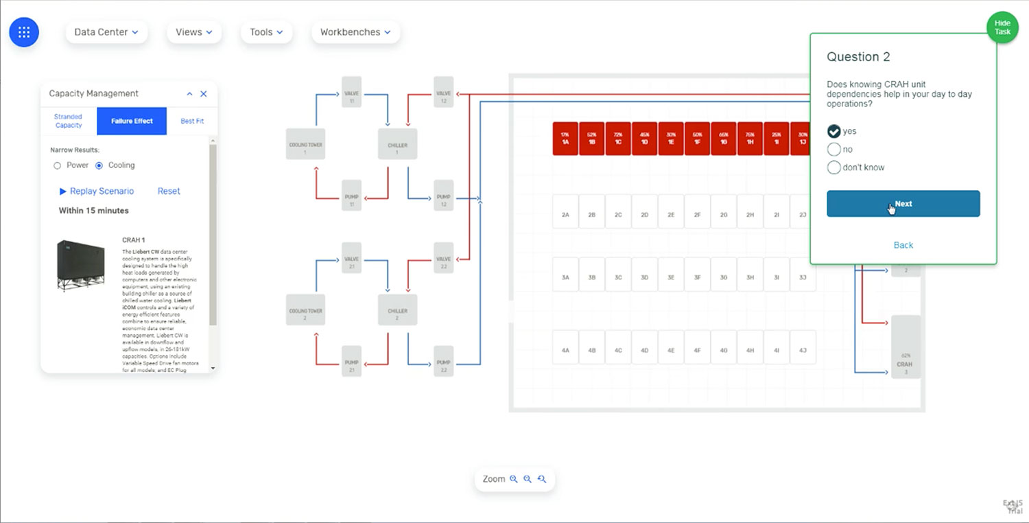
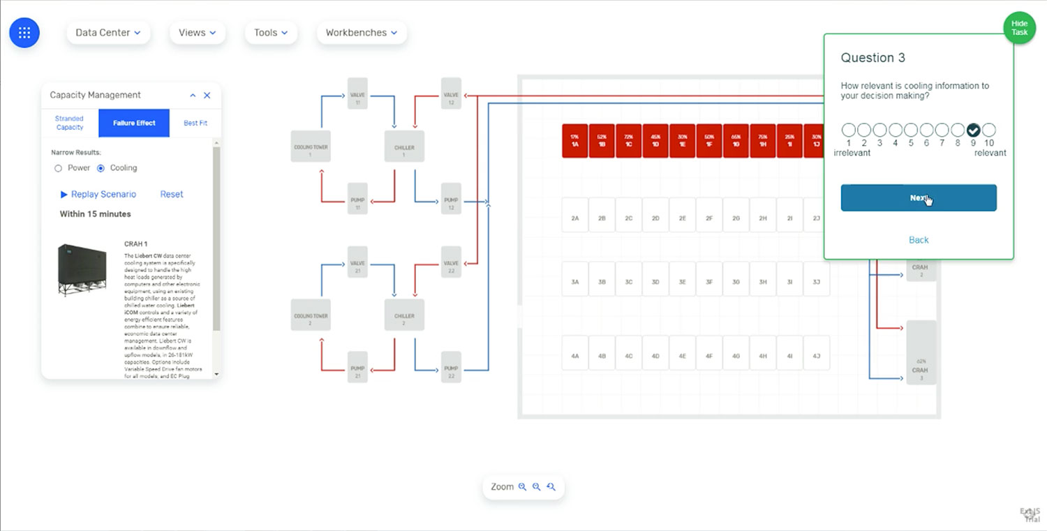
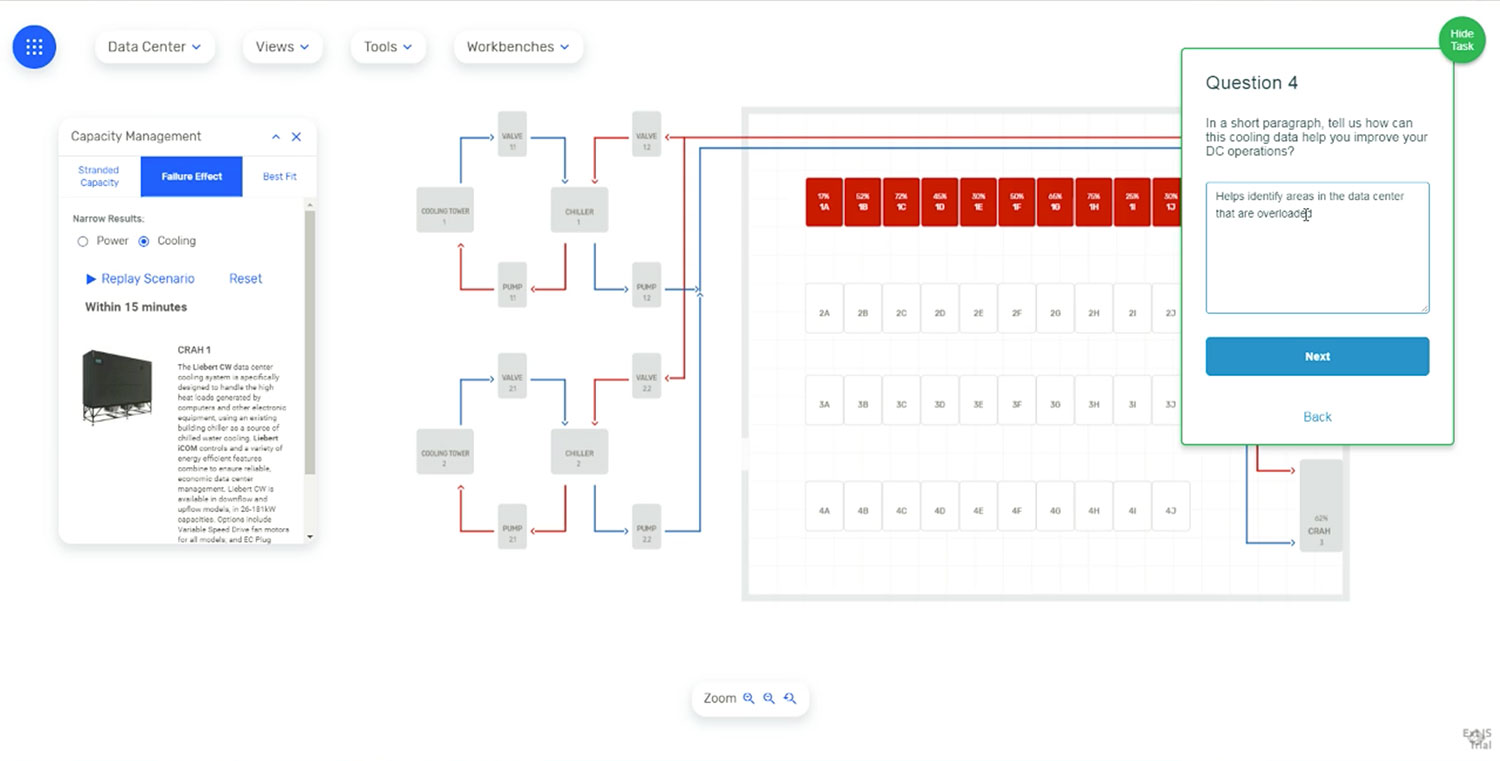
Tasks: 17-19 - Failure Effect - Cooling.

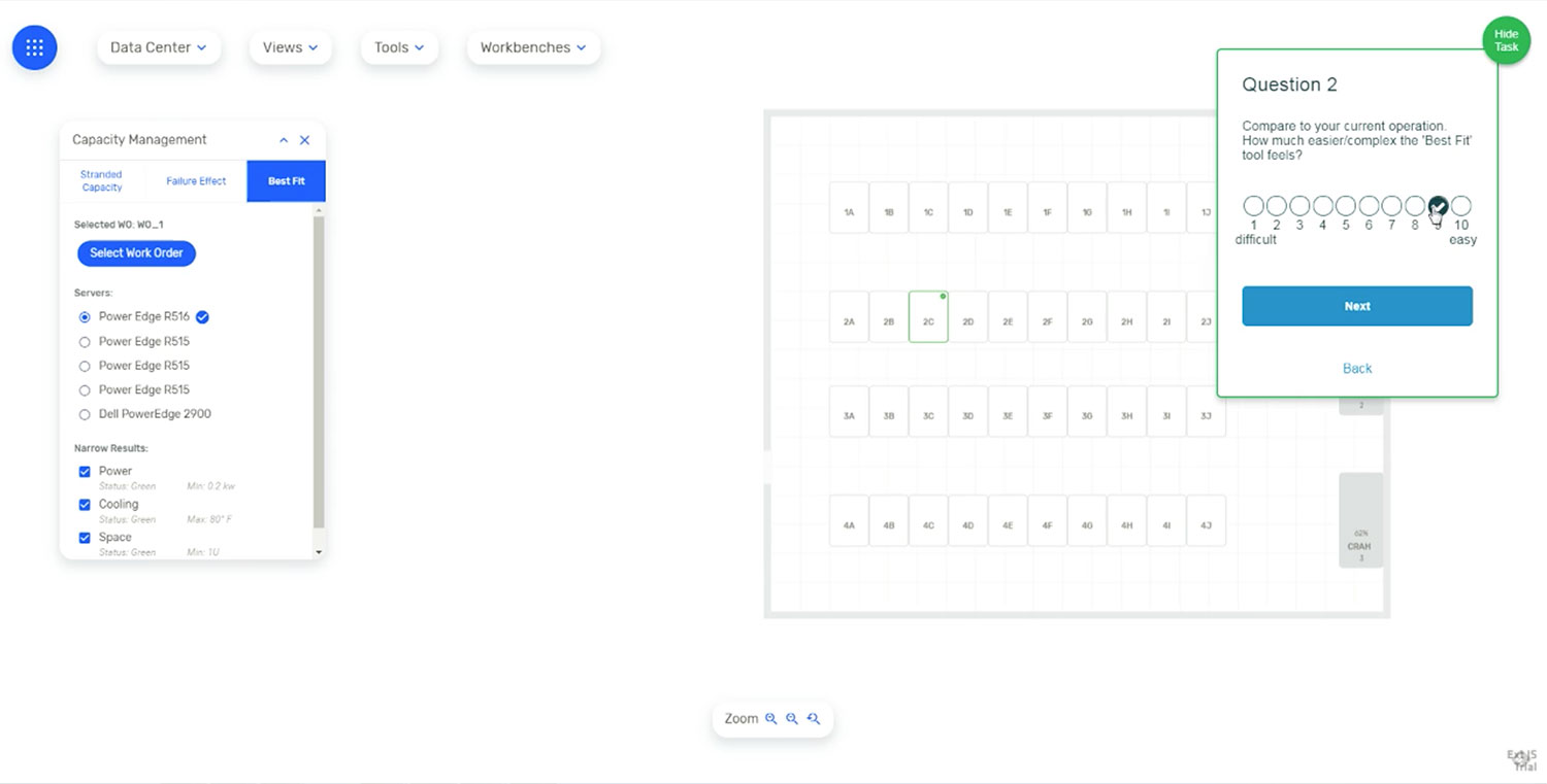
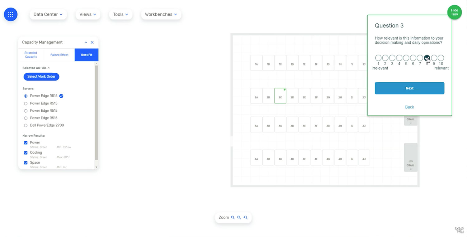
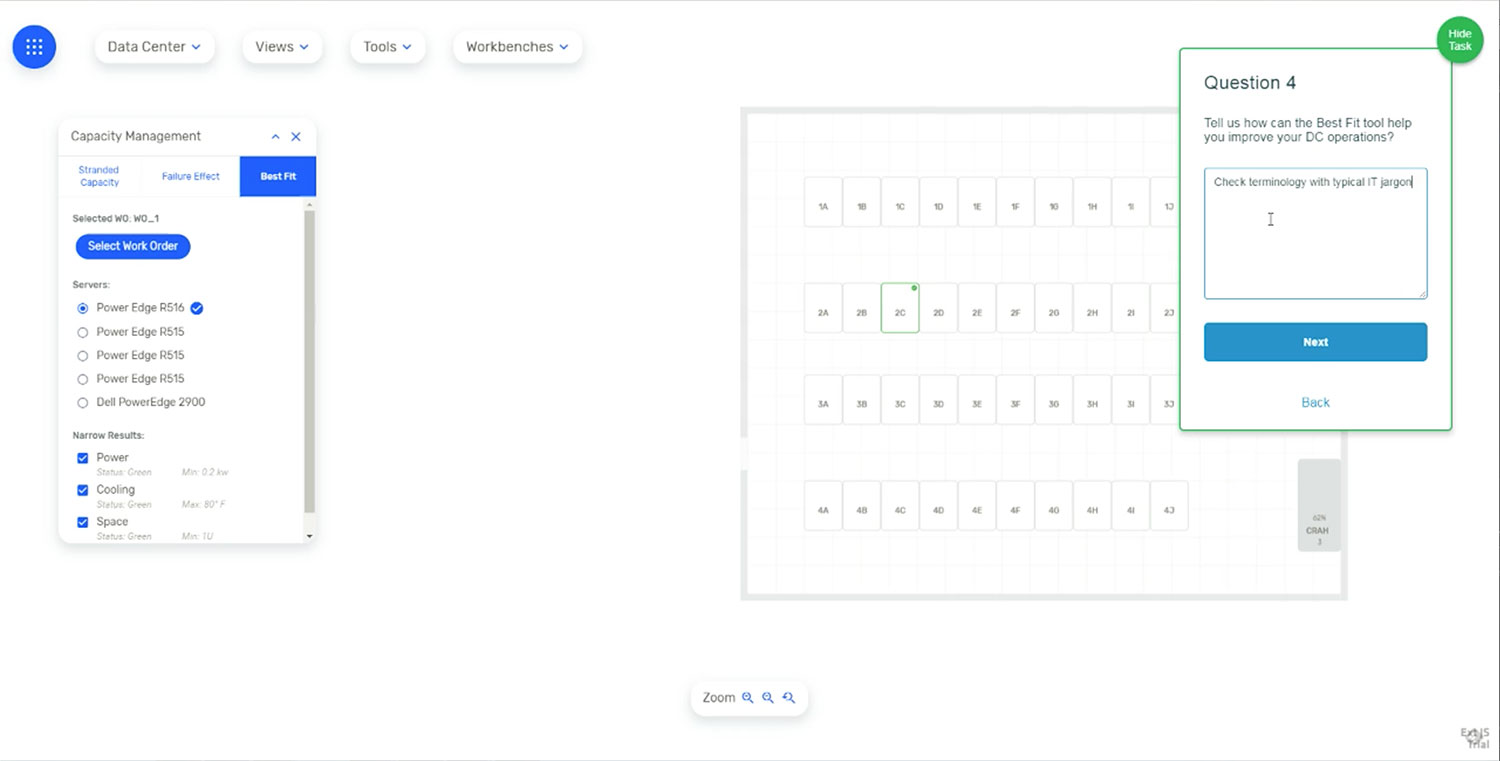
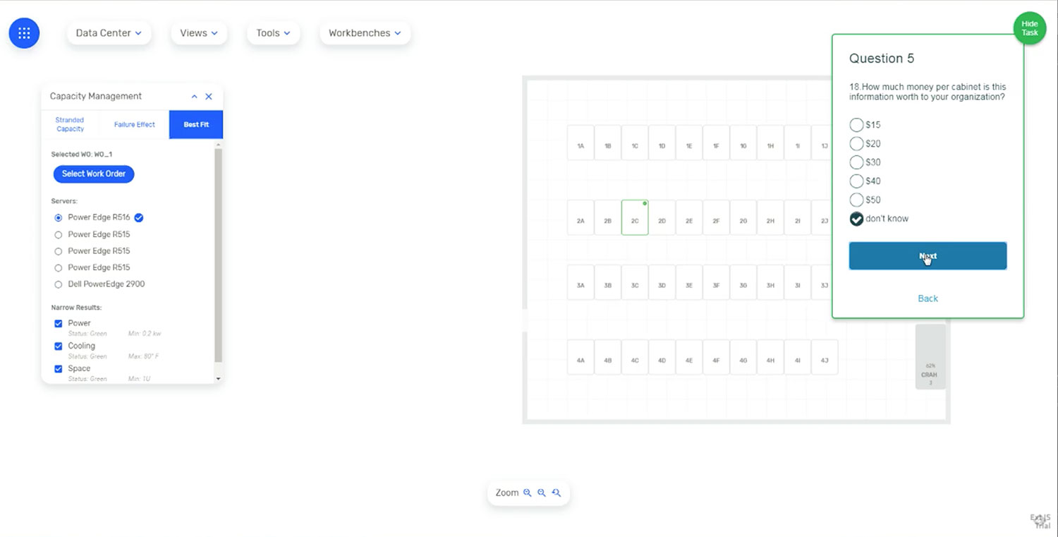
Tasks: 20-26 - Best Fit.