Jupyter.org Website
Jupyter.org is a growing set of free computing algorithm tools used by scientist worldwide. A website redesign was necessary to make these tools available to less technical audiences.
Project:
Jupyter.org - Website Redesign
My Role:
UX Design Leader
Tools:
Figma
Adobe Illustrator
Adobe PhotoShop
HTML5/CSS
Validately
UserTesting.com
Trello
Loop11
Brief
Jupyter software is a suite of free tools designed for interactive and reproducible computing. This is an open source project maintained by a community of scientists, developers, sponsors, and contributors who's main goal is the dissemination and improvement of these tools for the benefit of everyone. Jupyter.org has become the standard for workflows in data science, machine learning, and other technologies.
The key problem faced by this free product is that its current aim is to guide and inform individuals, organizations, contributors, and sponsors about Project Jupyter's core values, technology, and active community. The previous website design did not effectively communicate this information to these parties. A close up view of the website architecture and a Heuristic Evaluation analysis showed that a complete redesign was necessary.
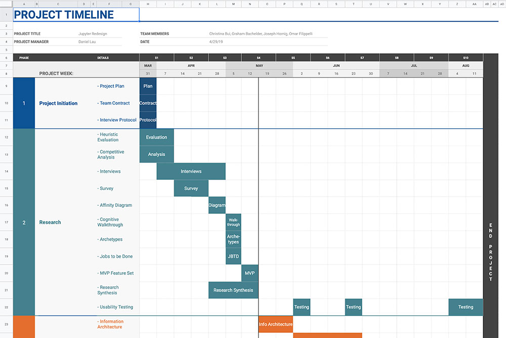
Phase 1 - Planning
Project Plan
Assuming the role of an UX agency, we set out to evaluate the website, its users, and the overall Jupyter ecosystem of products and offerings. Detail documentation ⟶
Phase 2 - Discovery
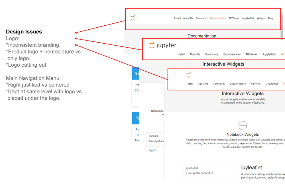
Heuristic Evaluation
We evaluated jupyter.org to get a baseline for what needed to be improved and why. It also helped point out key successful aspects of the current design. Because this is an open source community, the website is not actively maintained by any single person, thus showing many basic design inconsistencies. Detail documentation ⟶
Phase 2 - Discovery
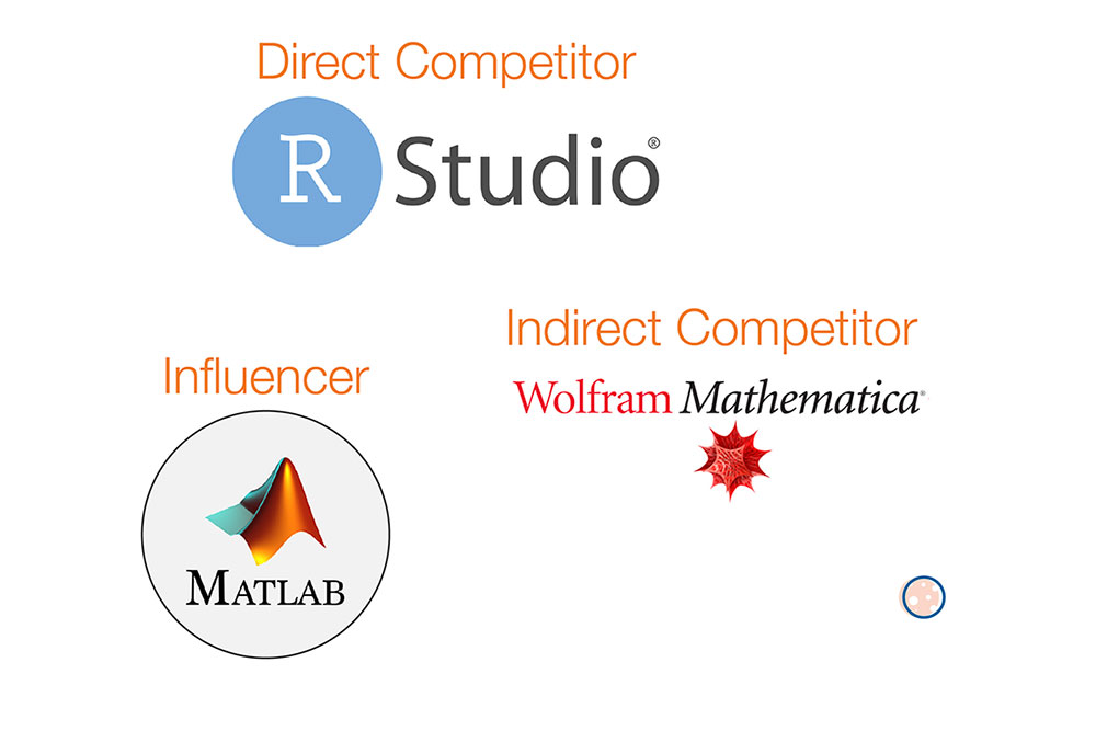
Competitive Analysis
In contrast to Jupyter, competitors have the advantage of being for-profit and employing vast development teams, so while Jupyter’s user base is significantly larger, competitors had much more effective websites. Detailed analysis of these sites brought substantial insights into our own designs and helped us understand what works more effectively in this industry. Detail documentation ⟶
Phase 3 - Synthesis
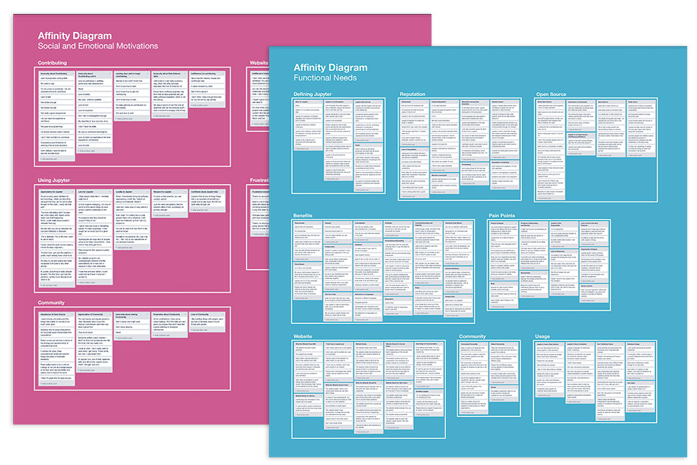
Affinity Diagrams
We created two Affinity Diagrams using insights gathered from our surveys and in-depth interviews with Jupyter users, non-users, contributors, and community members. The diagrams later helped us construct jobs-to-be-done and archetypes. Detail documentation ⟶
Phase 3 - Synthesis
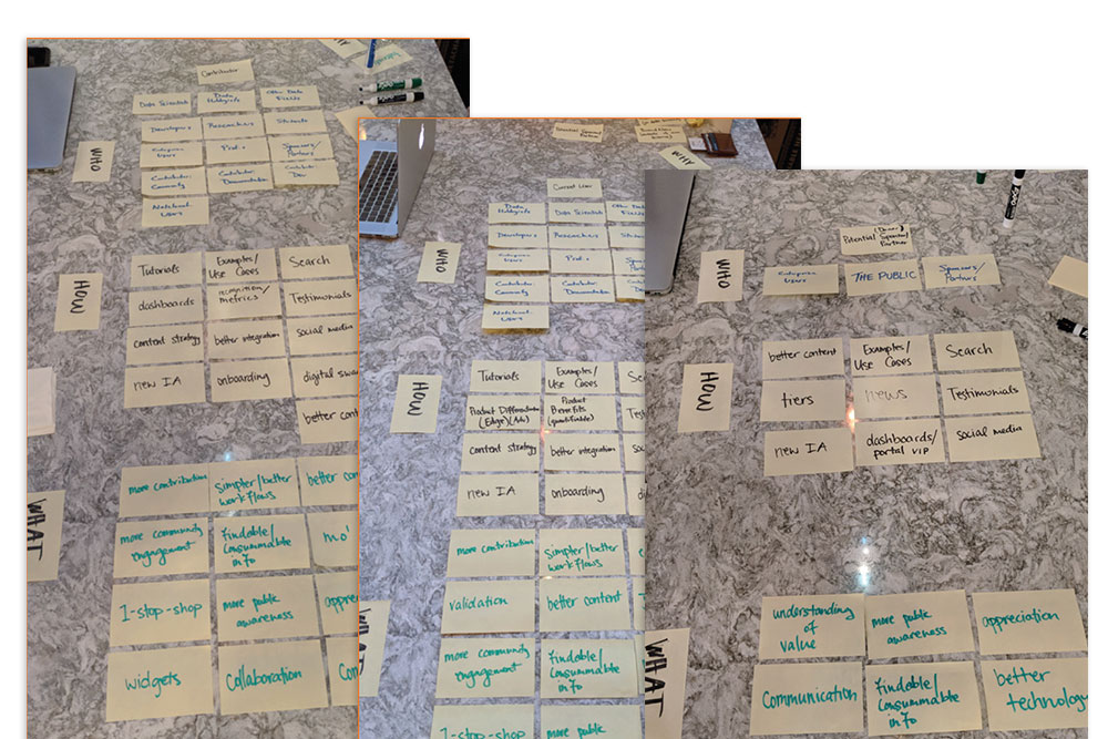
Cognitive Walkthroughs
We used Cognitive Walkthroughs to aid our understanding of the site’s information architecture, user journey flows, and navigation pain points. Detail documentation ⟶
Phase 3 - Synthesis
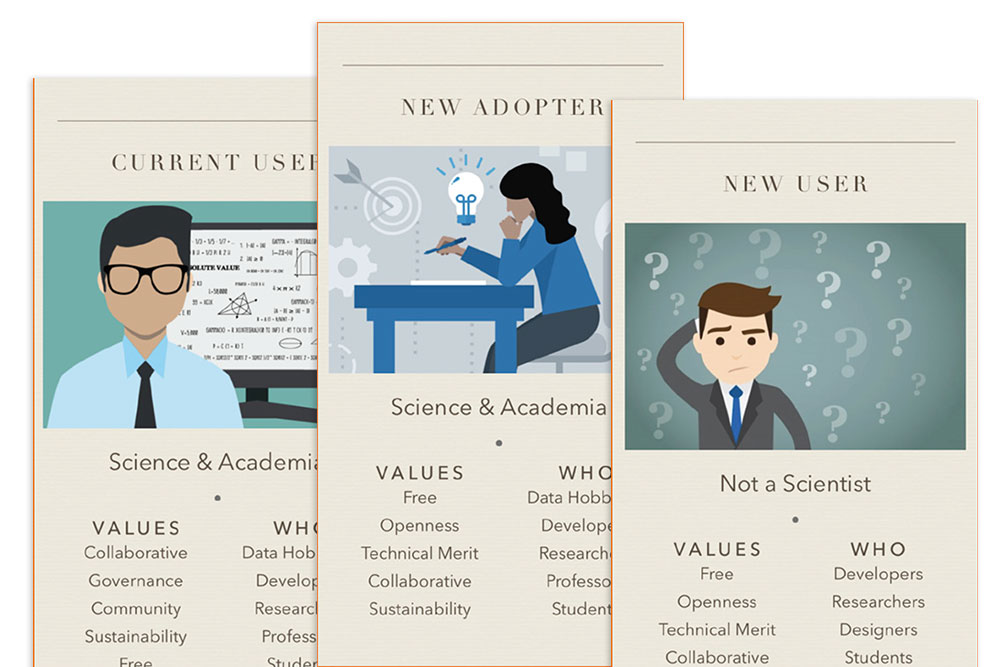
User Archetypes
Based on the affinity diagrams, we arrived at five distinct user archetypes. These archetypes embody various different backgrounds and needs of desired and potential site visitors. Detail documentation ⟶
Phase 4 - Design
Design Jam
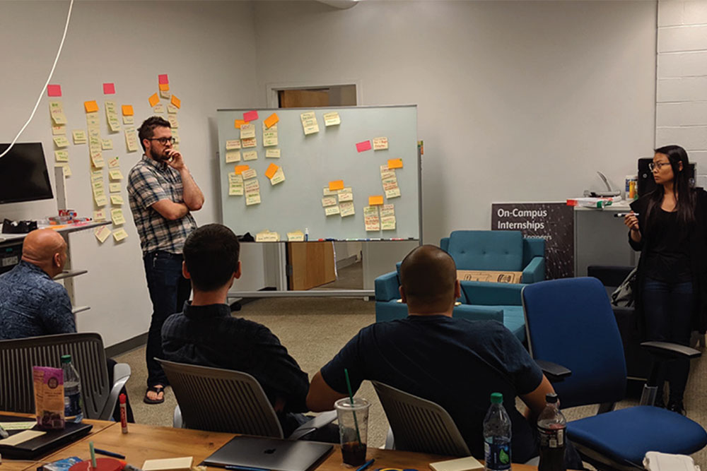
When it was time to transition from the research phase to the design phase, we gathered in San Luis Obispo, CA for 3 days to have our first meeting with a key decision maker. We presented our research findings to our clients and began structuring the website. Detail documentation ⟶
Phases 5-6 - Iterative Testing
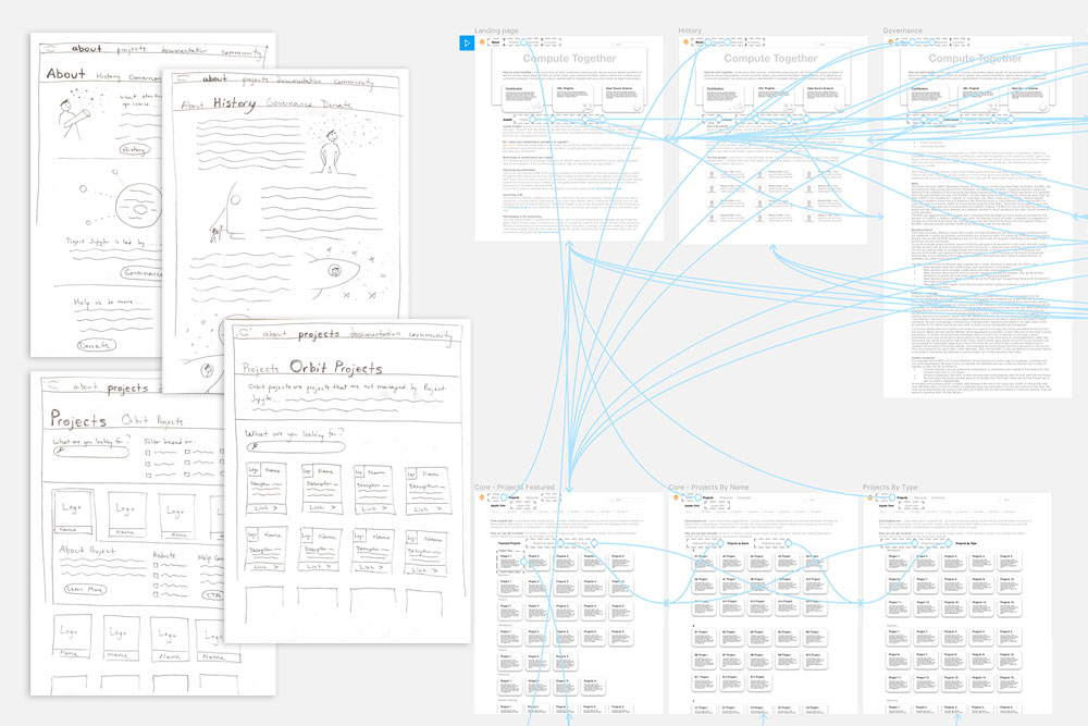
Wireframes & Prototypes
For the initial wireframes and prototypes, we used the Validately.com tool to conduct remote and unmoderated user testing sessions. Our goal was to see whether those who are unfamiliar with the website could intuitively navigate the product based on the information architecture and hierarchy we designed. Detail documentation ⟶
Phase 7 - Styling
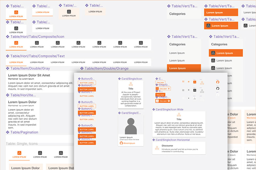
Design System
To meet the client's needs and to optimize the benefits of open-source, we decided to utilize Google’s established Material Design as the foundation for our design system. By customizing this open-source library, we enabled a depth of branding without having to leverage the tested, flexible, and accessible aspects Material Design has to offer. Detail documentation ⟶
Phase 8 - Final Deliverables
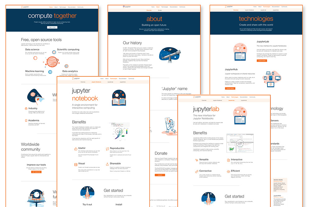
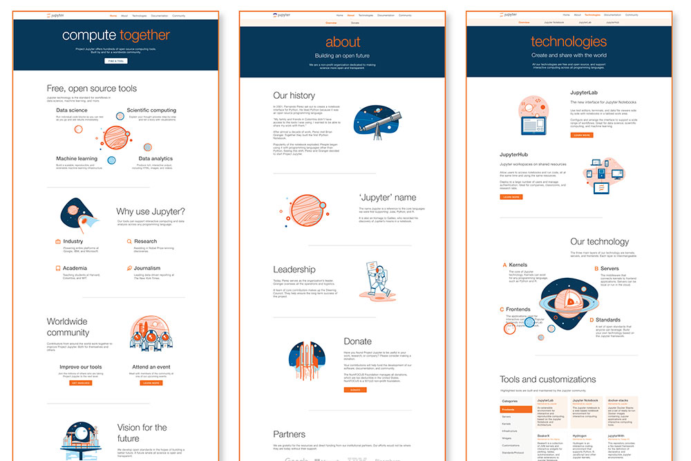
Hifi Prototype
After several rounds of usability tests and collaboration with the community, we were able to create a high fidelity prototype that was user-friendly, accessible, and scalable. We improved content discoverability for users both new and current by building a website filled with engaging content, an organized sitemap, and a dynamic pivot table. Detail documentation ⟶